Grotesque & neo-grotesque sans serifs
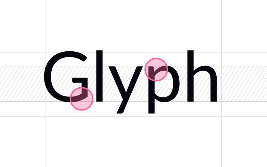
Grotesque typefaces appeared in the 19th and the first decades of the 20th century. Those early sans-serif typefaces were characterized by awkward weight distribution and irregular curves. For example, glyphs had obvious stroke contrast, and the uppercase G and R had a spur. Early grotesque typefaces included Franklin Gothic, Monotype Grotesque, and Schelter Grotesk.
Over the 19th century, the style became more sleek, refined, and sophisticated. The neo-grotesques took these typefaces to a new level. Letterforms became more simplistic and lost irregular variations in line weight.
1957 was a big year for neo-grotesque sans serifs — the immortal Helvetica was released. Other typefaces of this category include MS Sans Serif, Arial, Bell Gothic, Bell Centennial, and Univers.


