Geometric sans serifs
As the name indicates, geometric sans serifs have simple, modern, geometric forms. They appeared in the early 1920s and have become widely popular for headlines, logos, and packaging but were rarely seen for body text. Although geometric sans serifs have a remarkably simple form, they're less legible than grotesques.
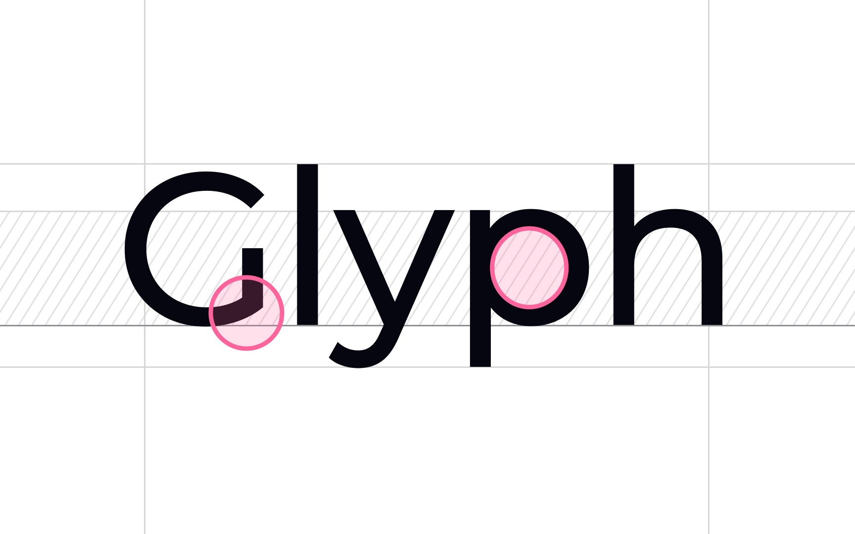
You can recognize these letterforms by straight, monolinear lines, perfect circular "o" glyphs, geometric bowls of "a" and "p," and little or no stroke contrast.
Among geometric sans serifs, you can find Avenir, ITC Bauhaus, Futura, Montserrat, and Harmonia Sans.
Top contributors