Balance depth and accessibility
Metric systems should strike the right balance between comprehensive data for experts and accessible insights for everyone else. Too technical, and most people won't engage with your metrics. Too simplified, and you risk losing the nuance needed for good decisions. Finding this middle ground is essential for widespread adoption.
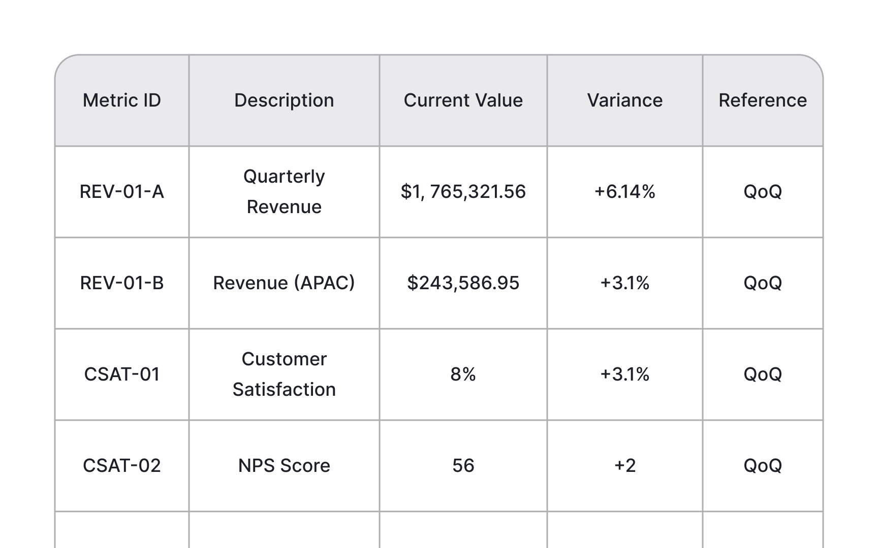
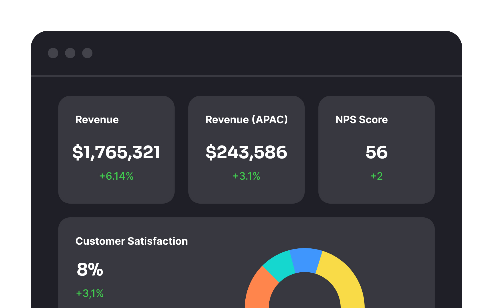
Consider creating different views of the same metrics tailored to different audiences. Executive summaries might show high-level trends and outcomes, while team dashboards include more operational details and leading indicators. Data scientists might need access to raw data that would overwhelm others.
Use visual cues and plain language to make metrics more accessible without sacrificing depth. Color coding (red/yellow/green) quickly communicates status, while trend indicators (up/down arrows) show direction without requiring detailed analysis. Always include definitions and context alongside metrics so users understand what they're seeing without needing specialized knowledge.
