Make metrics accessible to all stakeholders
Metrics create value only when they inform decisions across the organization. Even the most sophisticated measurement framework fails if stakeholders cannot understand, access, or act upon the insights it provides. Your main dashboard should focus on the essentials: your North Star, objectives, and key results.
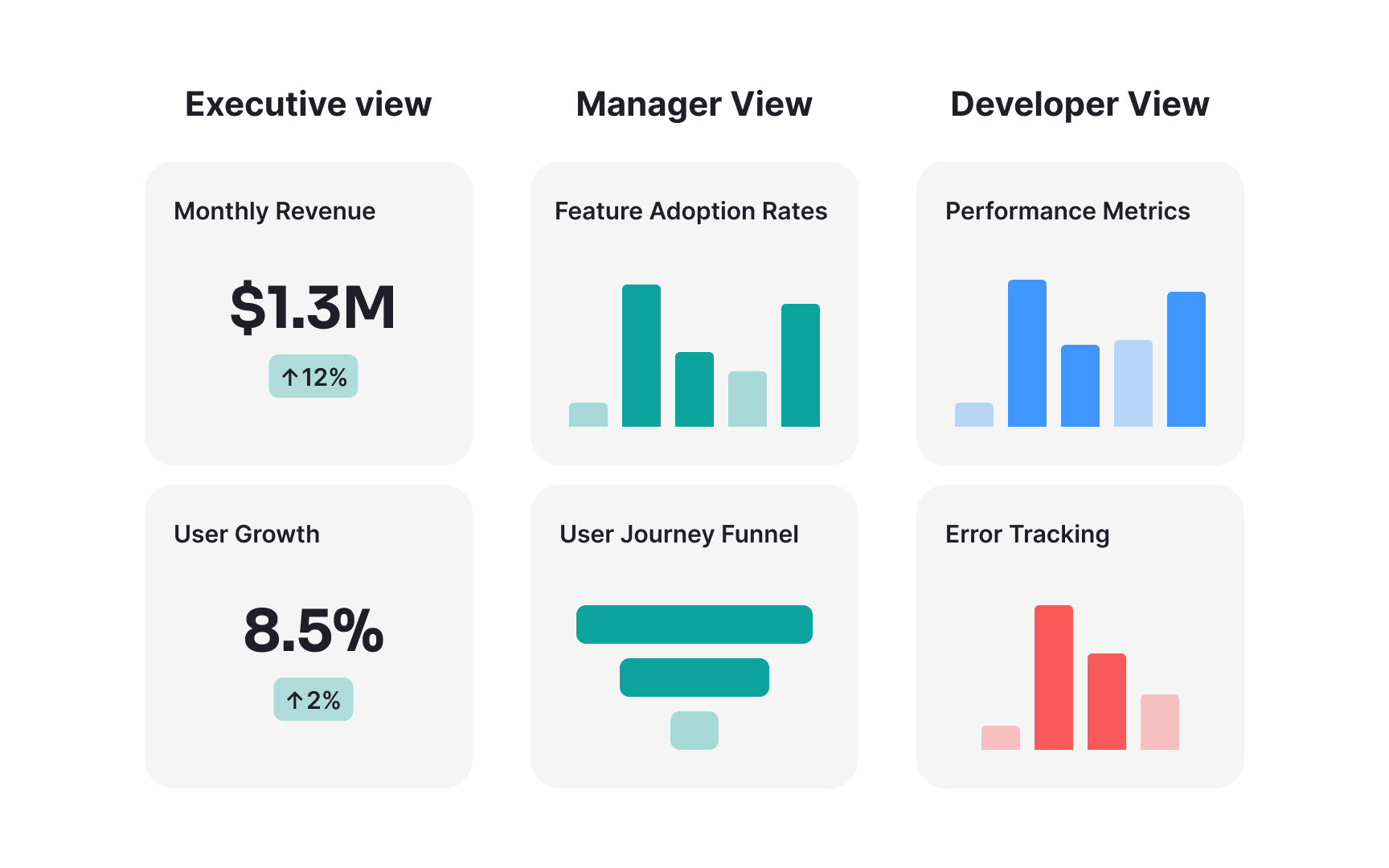
Other metrics can be placed on dashboards tailored to different stakeholders:
- Executive leadership needs high-level business metrics tied directly to strategy and financials.
- Product managers need detailed behavioral metrics that suggest feature improvements.
- Engineering teams need performance and technical metrics that highlight optimization opportunities.
- Each group requires different levels of detail, context, and visualization.
Accessibility also means creating consistent, trustworthy data sources. When different teams use different definitions or calculation methods for the same metrics, confusion and conflict inevitably follow. Document metric definitions clearly, including exactly how each is calculated, what data sources feed it, and what limitations or caveats apply. This transparency builds confidence and encourages wider adoption.
Visual presentation also dramatically affects comprehension. Dashboards should highlight trends and patterns rather than overwhelming viewers with raw numbers. Use consistent color coding for related metrics, provide clear titles and labels, and include brief interpretations that explain what the numbers mean. The best dashboards answer the question "so what?" by making the implications of metric changes immediately apparent to viewers.
