Shape contrast
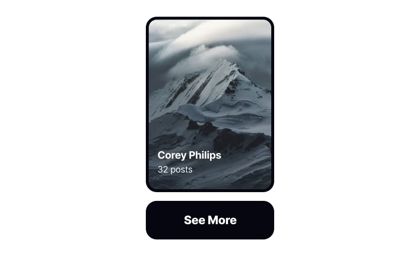
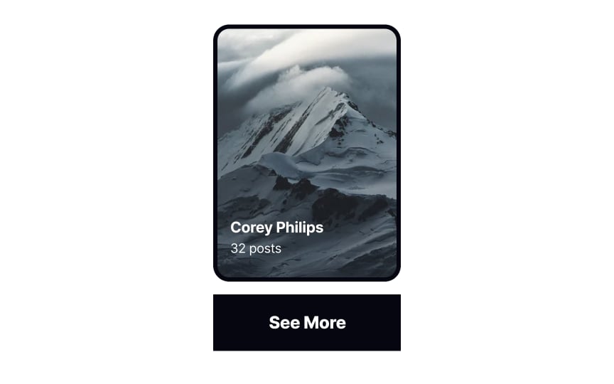
Highlighting differences in shape can help us understand that elements in a composition perform different functions. For example, a rectangle button with sharp corners will immediately stand out among a sea of images with rounded corners, signaling to users that it’s an interactive element.


