Internal rhythm in UI
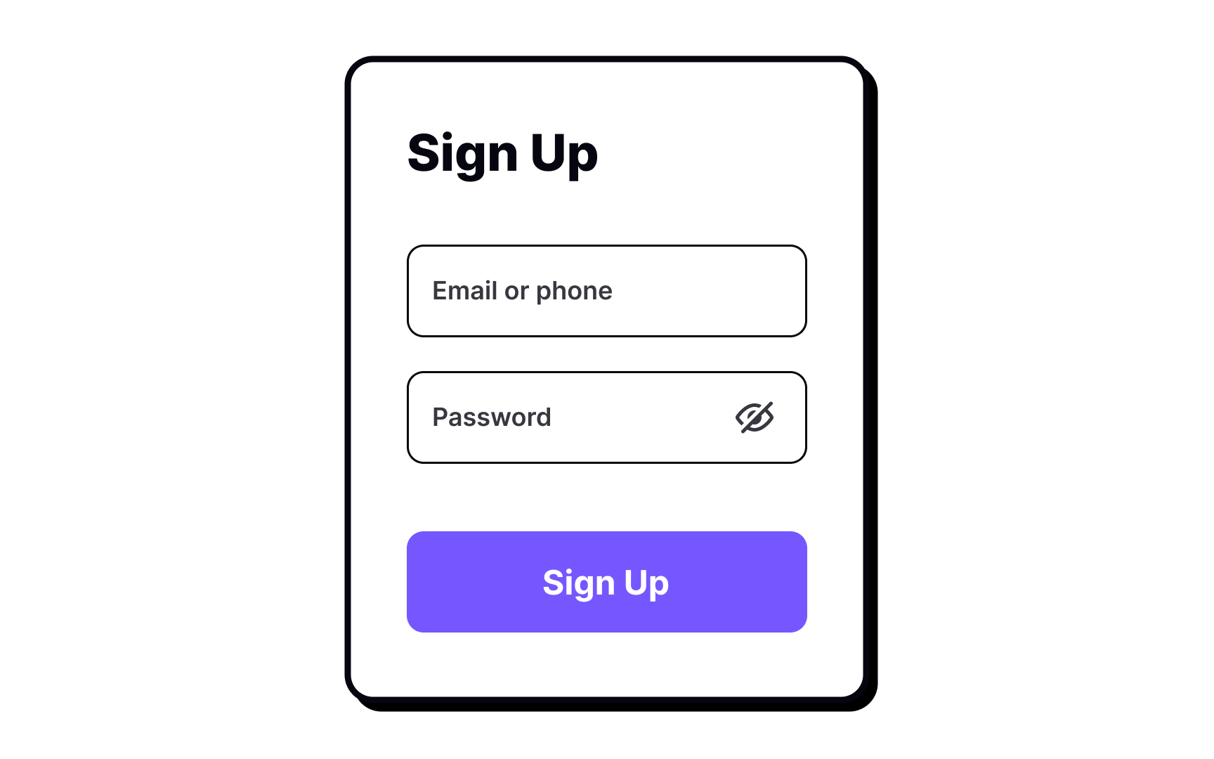
How do you set the internal rhythm designing something as necessary as a sign-up form? You add spaces between inputs, titles, and CTAs, making sure users can quickly scan them without being distracted or confused.
How do you set the internal rhythm designing something as necessary as a sign-up form? You add spaces between inputs, titles, and CTAs, making sure users can quickly scan them without being distracted or confused.
