Break up text with images
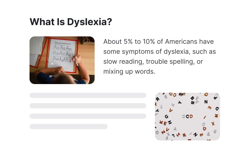
Think of images as natural breaks in your content. They give your eyes and brain a moment to pause and process. Just like taking a breather during a long run, well-placed visuals help prevent cognitive fatigue and make information easier to digest. This is especially helpful for people with dyslexia, who might find walls of text particularly challenging.
Getting the balance right makes a huge difference. Each image should earn its place by either explaining something complex, highlighting a key point, or giving readers a mental checkpoint in their journey through the content. But remember to give your visuals some breathing room. Cramming them too close to text can make things feel cluttered rather than helpful.
Not all visuals are created equal though. Skip the flashy patterns and overly decorative elements that might compete for attention. Clean, simple visuals that complement your content work best.


