CSS rem (rem)
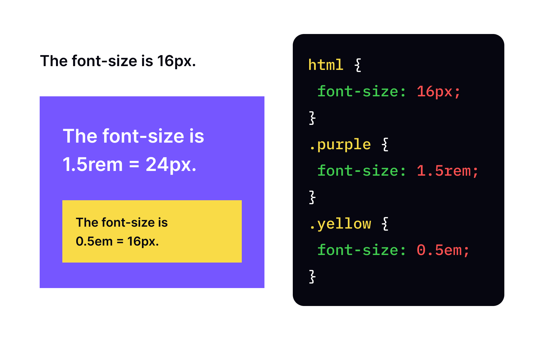

Rem stands for root em, and it's another relative unit based on font size. Unlike em, it doesn't refer to a direct parent, but the font size of the entire HTML document. For this reason, it is a good practice to define the font size for the whole web page and then refer to this value using rem. In contrast to em, even in complex structure, rem doesn't require many calculations as it's not affected by inheritance as em units are.
The rem unit acts as an em on the entire document scale. On web pages, setting an element's dimensions in rem allows you to scale the font size with JavaScript. When constructing scalable macro-typographic schemes, rem is used to maintain specific proportions of the font size of individual elements, the spacing between them and the line spacing.
