Visibility
The idea is that lighter colors are easier to see than darker colors, likely because we connect light with daytime and dark with nighttime. This makes white feel more visible than black, and that visibility can influence how people behave.
People often link light with "good" behavior. For example, in one study, people who thought about doing something good felt the room was brighter. Another study found that people donated more money when they felt watched, like by an image of eyes. This suggests that people want others to notice their good actions.[1]
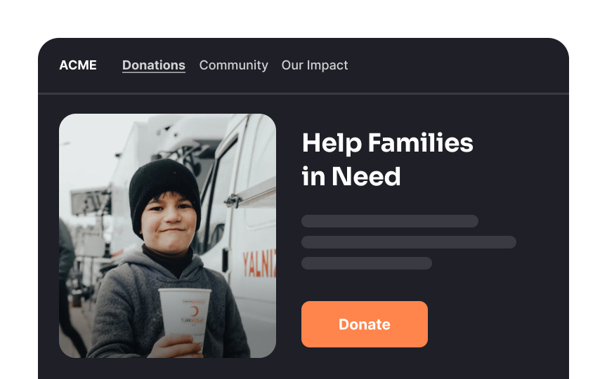
On the other hand, darker colors, which feel less visible, might sometimes encourage "bad" behavior. For instance, research on aggression in sports shows that teams wearing black uniforms tend to get more penalties.
Designers can use this knowledge to guide user behavior:
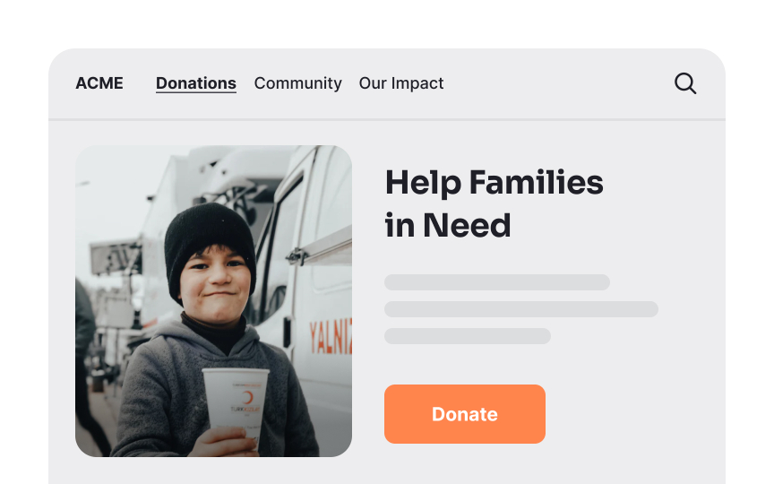
- Use white backgrounds for charity websites. White makes donations feel more visible, leading to more contributions.
- Use darker backgrounds for beginner software. New users might prefer a dark interface where they feel less exposed and can make mistakes without feeling judged.
- Use dark themes for adult content. A dark interface can make users feel more private and less noticed.
While these associations between light and dark colors are rooted in human psychology, it’s important to remember that systemic racism has also reinforced certain biases. However, the concept of light vs. dark as it relates to visibility and behavior is more about natural associations than racial implications.


