Patience
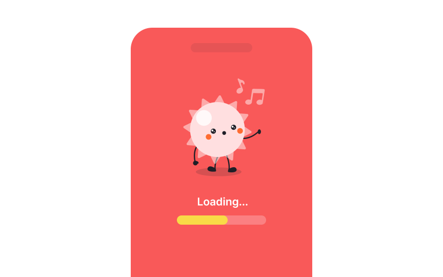
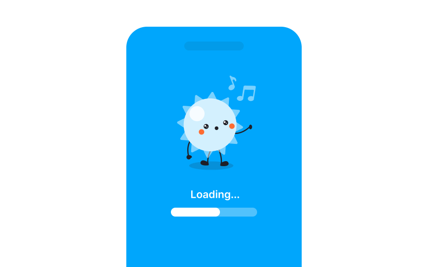
Using blue in loading screens is an effective way to reduce user stress and create a more relaxed experience. Blue is widely recognized for its calming effects, as it has been shown to slow heart rates and reduce feelings of anxiety. This makes it an ideal color for situations that require patience, such as waiting during loading screens. By incorporating blue, designers can help users feel more at ease and minimize the frustration that often accompanies waiting.
In general, cool colors like blue, green, and purple are known for their ability to create calm and soothing environments. These colors are often used in settings where relaxation and concentration are key, such as in healthcare environments, bedrooms, and workspaces.[1]


