Burn charts for sprint tracking
Burn charts give Scrum teams visual pictures of sprint progress, making it clear whether they're on track to meet their commitments. These charts come in 2 main types, each with different benefits for tracking and forecasting:
- Burn Down charts track remaining work over time, typically showing story points or tasks vertically and sprint days horizontally. The ideal burn down follows a diagonal line from the starting commitment to zero by sprint end. When the actual line goes above this ideal, it signals a possible risk to sprint completion.
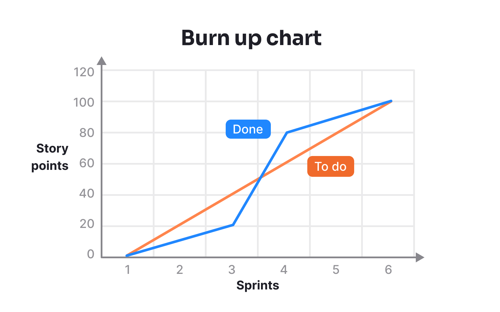
- Burn Up charts show completed work building toward a target. Unlike burn downs, they can also show scope changes by moving the target line. This makes burn ups especially useful when the sprint scope isn't fixed, as they clearly show the impact of added work on delivery dates.
Both charts reveal important team patterns. Flat lines early in the sprint might show that the team is still planning or facing startup issues. Sudden drops often show when several stories finish at once, while upward movements on burn downs highlight scope additions or re-estimation. Teams use these charts not just for tracking but for communicating with stakeholders. They provide an honest, visual picture of progress that tells more than simple "on track" or "behind schedule" statements.
Pro Tip: Update burn charts daily and display them where everyone can see them. Their value comes from the ongoing visibility they provide into sprint health.
