Measuring Agile
Master practical Agile measurement techniques to forecast work, track progress, and continuously improve team performance.
Measuring work in Agile teams transforms abstract concepts into meaningful insights. Behind every successful Agile implementation lies a thoughtful approach to measurement that balances predictability with flexibility. Story points, team capacity, and velocity create a shared language that helps teams plan without false precision. Flow metrics reveal the hidden patterns in how work moves through a system, where it flows smoothly and where it gets stuck. Cumulative flow diagrams and burn charts visualize progress in ways that spreadsheets never could, turning data into actionable information.
These measurement approaches aren't about control or micromanagement but clarity, transparency, and continuous improvement. When teams understand their own patterns and capabilities, they make better decisions, set realistic expectations, and deliver more reliably. Effective Agile measurement creates the foundation for sustainable pace, better forecasting, and a culture where data informs, rather than dictates, how teams work.
Relative estimation is a cornerstone of Agile measurement that shifts teams away from predicting exact hours to comparing work items against each other. Instead of asking "How long will this take?", teams ask "Is this story larger, smaller, or about the same as that one?" This approach acknowledges the inherent uncertainty in knowledge work while still providing the structure needed for planning. When teams estimate relatively, they bypass the false precision trap that often leads to missed deadlines and eroded trust. A task that one team member thinks will take 3 hours might take another 8 hours based on experience and skill level. Relative sizing cuts through these differences by establishing a shared understanding of complexity and effort.
Pro Tip: Pick a medium-sized story everyone understands as your starting point. Then compare all other stories to this reference to decide if they're bigger or smaller.
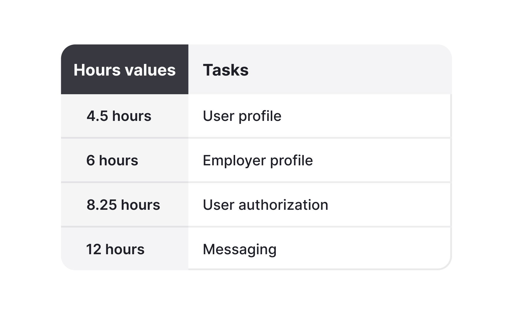
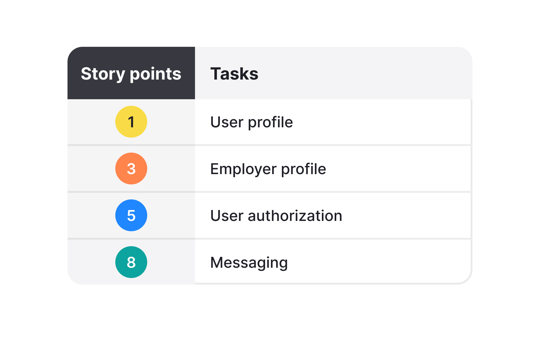
Over time, teams build a shared understanding of what a "5-point story" means for them, making future estimation faster and more accurate. Disagreements during estimation are actually valuable. When one developer estimates 13 points while others estimate 3, the discussion that follows often reveals important information that might otherwise stay hidden until coding begins.
Pro Tip: When team members pick very different estimates, take time to talk about why. These discussions often reveal hidden risks or missing requirements.
Team capacity is the realistic amount of work a team can handle in a sprint, considering all factors that affect availability. While velocity looks at past performance, capacity focuses on the specific circumstances of the upcoming sprint. Capacity changes based on team size, planned time off, holidays, and non-project work like meetings or support tasks. A team that usually completes 40
Others simply adjust their average velocity based on who's available for the upcoming sprint. Tracking capacity alongside velocity shows important patterns.
When teams consistently deliver less than their expected capacity, it often points to problems like too many meetings, frequent task switching, or untracked support work taking up development time. Capacity planning prevents teams from taking on too much work. It creates a sustainable pace by recognizing that a team's ability to deliver changes is based on real-world conditions.
Pro Tip: When figuring out capacity, remember to count the "hidden work" that takes up team energy but doesn't show up on the sprint backlog, like helping with production issues, unexpected meetings, and mentoring activities.
Velocity measures how much work a team completes in a sprint, usually counted in
Teams should avoid trying to game velocity by inflating estimates or claiming partial credit for unfinished work. Remember that velocity is a measurement tool, not a performance metric. Comparing velocity between different teams doesn't work because each team develops its own scale. The goal is consistent, reliable delivery, not maximizing the number.
Pro Tip: When forecasting with velocity, give ranges instead of single dates. Saying "4-6 sprints based on our velocity range of 25-35 points" sets more realistic expectations with stakeholders.
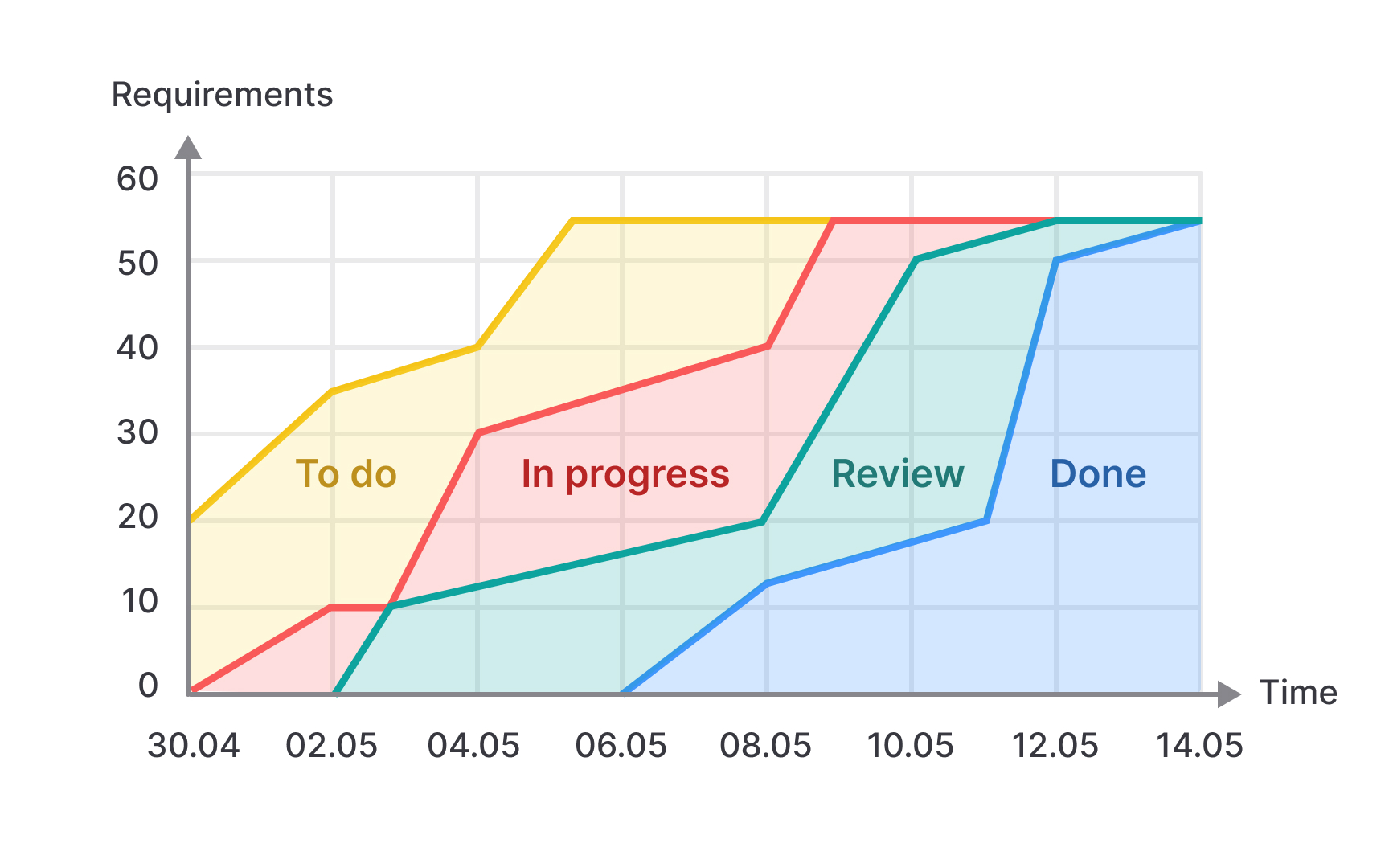
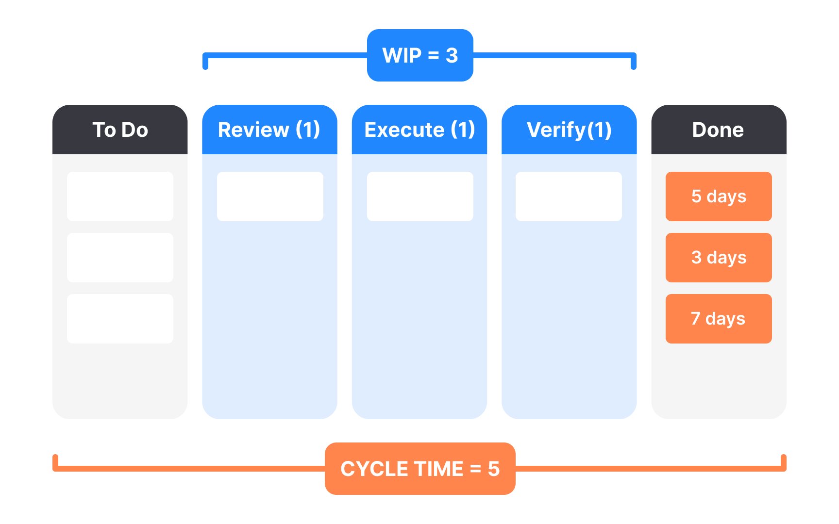
Cumulative Flow Diagrams (CFDs) show how work moves through a system over time, creating a powerful tool for Scrum teams. Each colored band shows a workflow state like "To Do," "In Progress," "Review," and "Done," revealing how work builds up and flows between states. The vertical space between bands at any point shows the work in progress (WIP) for that state. Widening bands show accumulating work, potentially revealing bottlenecks where items are piling up. The ideal CFD shows parallel bands moving upward together, indicating smooth flow through the system. CFDs reveal cycle time (how long work takes to move through the process) by measuring the horizontal distance between when work enters the system and when it's completed. Growing horizontal distances show slowing delivery, while consistent distances suggest stable, predictable flow.
Unlike single-point measurements, CFDs provide context about how work patterns change over time. They help teams identify exactly where the flow breaks down, whether in early planning stages, during development, or in final testing and review. Teams review CFDs during Sprint Retrospectives to find system-wide patterns beyond individual stories. Questions like "Why is our 'In Review' band getting wider?" lead to meaningful process improvements that address root causes rather than just symptoms.
Pro Tip: When looking at CFDs, watch for sudden changes in bandwidth. These often show process changes, staffing shifts, or external dependencies that might not show up in other metrics.
Burn
- Burn Down charts track remaining work over time, typically showing
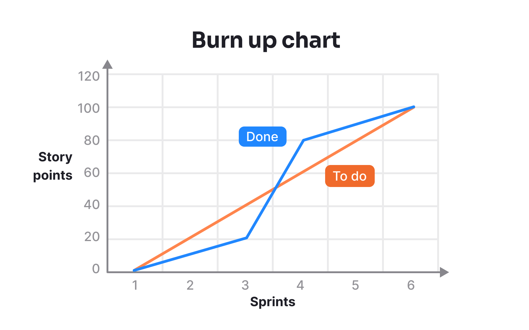
story points or tasks vertically and sprint days horizontally. The ideal burn down follows a diagonal line from the starting commitment to zero by sprint end. When the actual line goes above this ideal, it signals a possible risk to sprint completion. - Burn Up charts show completed work building toward a target. Unlike burn downs, they can also show scope changes by moving the target line. This makes burn ups especially useful when the sprint scope isn't fixed, as they clearly show the impact of added work on delivery dates.
Both charts reveal important team patterns. Flat lines early in the sprint might show that the team is still planning or facing startup issues. Sudden drops often show when several stories finish at once, while upward movements on burn downs highlight scope additions or re-estimation. Teams use these charts not just for tracking but for communicating with stakeholders. They provide an honest, visual picture of progress that tells more than simple "on track" or "behind schedule" statements.
Pro Tip: Update burn charts daily and display them where everyone can see them. Their value comes from the ongoing visibility they provide into sprint health.
Metrics only provide value when teams use them to drive improvement rather than just report status. The most effective Agile teams create a metrics system where numbers inform team discussions about process and practice. Sprint Reviews offer a natural opportunity to connect metrics to outcomes. Teams might show burn
Retrospectives become more powerful when teams look at metric trends across multiple sprints. Rather than focusing on a single data point that might be unusual, teams look for patterns: "Our velocity has decreased three sprints in a row - what's changed in our process or environment?" The best metrics discussions focus on systems rather than individuals. When flow breaks down, teams ask "What in our process makes this difficult?" instead of "Who is causing delays?" This creates psychological safety that encourages honest evaluation. Metrics should evolve as teams mature:
- New Agile teams might focus on basic velocity and burn-down patterns.
- Experienced teams often shift toward cycle time, lead time, and other flow metrics that show subtler problems in their established process.
Cycle time measures how long work takes to flow through a team's active process, from start to finish. For Kanban teams, this metric indicates process health and efficiency, showing how quickly they turn customer requests into delivered value. Unlike Scrum velocity, which measures output per sprint, cycle time focuses on individual items flowing through the system. This works especially well for teams handling varied work types where story point estimation might be inconsistent. Teams track cycle time by recording when items enter and exit their workflow. Many teams use
Target cycle times help set realistic stakeholder expectations. Instead of promising specific delivery dates for each request, teams might commit to service levels: "85% of high-priority bugs are resolved within three days" or "New features typically take 10-15 days to complete." Rising cycle times signal process problems that need attention. Common causes include increasing work complexity, growing technical debt, or scope expansion during development.
Pro Tip: Break down cycle time by work type and priority. Emergency fixes, standard features, and infrastructure work should have different targets based on their complexity.
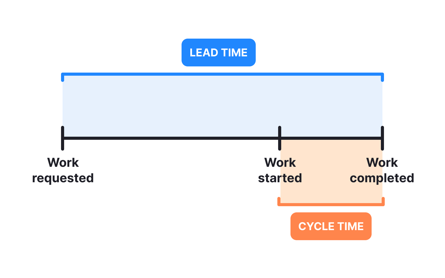
Lead time captures customers’ waiting experience, measuring from request to completion, including all queue time. While cycle time focuses on team
Teams use lead time and throughput together to improve workflows. High lead times with normal throughput indicate backlog prioritization issues, while decreased throughput signals problems in the active workflow. Historical throughput helps with forecasting. Teams can predict completion dates by looking at past rates rather than estimating each item individually, providing stakeholders with realistic expectations.
Pro Tip: Track the ratio between lead time and cycle time to find delivery delays. A high ratio shows items waiting too long before work begins.
Flow metrics reveal process problems before they cause significant delivery delays. Teams skilled in metric interpretation can spot issues early before they become crises.
Several common patterns in flow metrics reveal specific impediments that teams should address:
- The "expanding WIP" problem appears as rising cycle times and decreasing throughput despite consistent team capacity. This indicates teams starting too much work simultaneously, causing context switching. The solution is to implement WIP limits that match team capacity.
- "Bottleneck bounce" shows in Cumulative Flow Diagrams as alternating widening bands. Work piles up in one state, gets addressed, then backs up elsewhere. This reveals resource imbalances or dependencies between specialists. Cross-training and swarming help reduce these bottlenecks.
- "Queue bloat" appears as growing lead times without corresponding cycle time increases, happening when backlogs grow faster than completion rates. Regular
backlog refinement and clearprioritization policies address this issue.
Some metric changes can be misleading. For instance, cycle time might increase when teams implement quality improvements or address


Similar lessons

Agile Methodologies

What is Agile?
