
Reviews
3 reviews

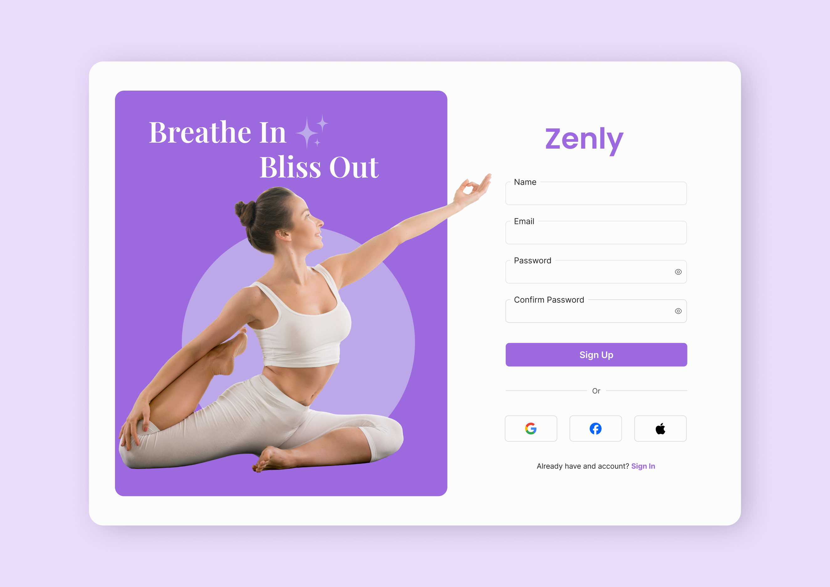
The Zenly Yoga sign-up page has a clean and calm design, perfect for a yoga site. The layout is simple, making it easy for users to navigate.
To improve, the sign-up button could be more noticeable with a bolder color or size. The font is a bit too light, which could affect readability, especially on mobile. A slightly heavier font would help.
Adding subtle animations or hover effects to buttons could make the page more interactive. Also, a soft background image or gradient could make the page feel even more inviting.
Overall, great start! A few tweaks will make it even better.

The design looks fresh and aesthetically pleasing, perfectly reflecting the yoga theme. However, here are a few recommendations for improvement:
The word "Zenly" should ideally be centered relative to the form to create better visual symmetry. Currently, it appears slightly misaligned, which disrupts the overall balance.
The "Sign Up" button could be made more prominent by increasing the text size or adding a subtle shadow. This would draw more attention to the primary call to action.
Consider slightly reducing the size of the model's image to create a more balanced visual hierarchy between the form and text elements.
At the bottom, the question "Already have an account? Sign In" could be updated to "Log In" to align with best practices and minimize potential confusion.
Overall, the design is impressive and conveys a sense of calm and harmony. These adjustments can make it even more polished and professional.

Great job! Keep practicing to improve our UI!
You might also like

eWallet App Development Project

Design a 404 Error Page

Uxcel Halloween Icon Pack


Color System

Duolingo Halloween Icon Pack


Website CRM Dashboard

Popular Courses

Design Terminology


Core UI Components


Enhancing UX Workflow with AI