Reviews
1 review
Great job on the research and ideation for these designs! I have some constructive feedback for you:
- The quick filters for the different categories are a nice touch. This feature is relevant and makes it easy for users to browse content related to the title.
- The black color of the cast icon has low contrast with the background, which could make it difficult for users with impaired vision.
- Regarding the blue ocean background, it works well for branding purposes. However, when used as a fill, especially for small components like buttons, the text on it can be obscured. One alternative could be to take the ocean blue and use it as a flat accent color in different components.
Keep up the good work!
4 Claps
Average 4.0 by 1 person
You might also like

Project
edX Sign-Up Page Redesign
OverviewThis project focused on improving the accessibility and user experience of the edX sign-up page. The original design had usability a

Project
Beautify Login page WCAG principles
This accessible signup form design follows WCAG principles by ensuring the interface is perceivable, operable, understandable, and robust fo

Project
Design Prioritization Workshop
A structured session to evaluate product ideas, prioritize high-impact features, and define a clear implementation plan.

Project
Sanyahawa - Personal Portifolio_login page
Used Figma in this design as my core tool. Iconify brilliant place to get icons and vector for the designs and a little twich to my image l

Project
eWallet App Development Project
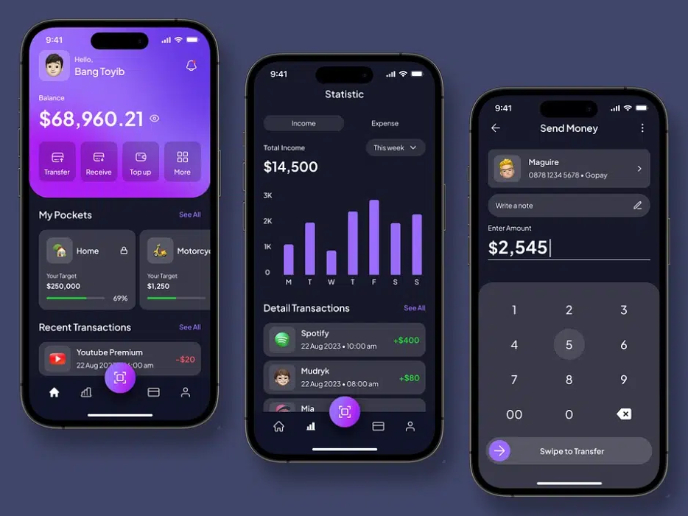
✨ Experience the future of digital payments with our innovative eWallet App design! Our concept combines powerful fintech capabilities with
Editors’ Choice
Project
Uxcel Halloween Icon Pack
🎃 Introducing the Uxcel Halloween Icon Pack! 🎃 This custom Halloween-themed icon set was created to enhance the seasonal user experience o
Interaction Design Courses

Course
UX Design Foundations
Learn UX design fundamentals and principles that create better products. Build foundational knowledge in design concepts, visual fundamentals, and workflows.

Course
Introduction to Figma
Learn essential Figma tools like layers, styling, typography, and images. Master the basics to create clean, user-friendly designs

Course
Design Terminology
Learn UX terminology and key UX/UI terms that boost collaboration between designers, developers, and stakeholders for smoother, clearer communication.


