Unity - Dashboard
Reviews
2 reviews
Hey, Quang!
Beautiful job, you chose a very elegant palette.
In the presentation I got confused by some details:
- The colors are always named #1, #2, #3, and #4; it should be nice to add a meaningful name, especially in the System colors.
- On the WCAG page, I couldn't understand if the scores are regarding the color used as a background with white text or if the color will be applied to the text with a white background.
- On the descriptions of Primary, Secondary, Tertiary, and System, there is a paragraph "Explain..." so I was expecting the explanation somewhere.
That is what I think could be improved, but the work looks amazing, you have a great eye for styling, and your presentation is pleasant to see, with beautiful fonts, color, empty spaces and positioning of the elements.
Thank you so much for your thoughtful feedback and kind words—I truly appreciate it!
I'll address the points you mentioned:
- I'll assign meaningful names to the colors, especially for the System colors, to improve clarity.
- On the WCAG page, I'll clarify whether the scores apply to text on a white background or white text on the color as a background.
- For the descriptions, I'll make sure to include the missing explanations where "Explain..." is currently written.
I'm glad you liked the overall styling and presentation! Your input is incredibly helpful, and I'll make these updates right away.
Hi Quang,
You did an amazing job!
This color system looks clean and clear to me, and it absolutely works for the project. I love the dark mode and the colors you chose they look modern and elegant.
You rock! Keep going, Quang!
Thank you so much!
14 Claps
Average 3.5 by 4 people
You might also like
Project
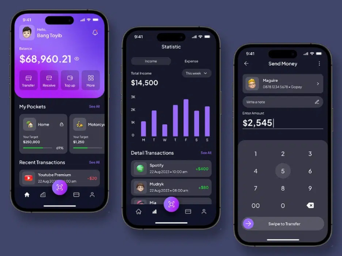
eWallet App Development Project
✨ Experience the future of digital payments with our innovative eWallet App design! Our concept combines powerful fintech capabilities with
Project
Design a 404 Error Page
Showcase your skills in designing a succinct, useful, and inclusive 404 error page that is in line with a brand voice and style.
Project
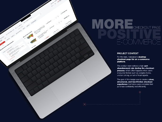
🖥 Desktop Checkout Flow Design
Designing a friction-free checkout experience to reduce cart abandonment 1️⃣ Project ContextAs part of the product design team for an e-comm

Project
Website CRM Dashboard
When designing the DataPollex CRM dashboard, the core question I kept asking was: what does a person actually need to do in the first 60 sec
Project
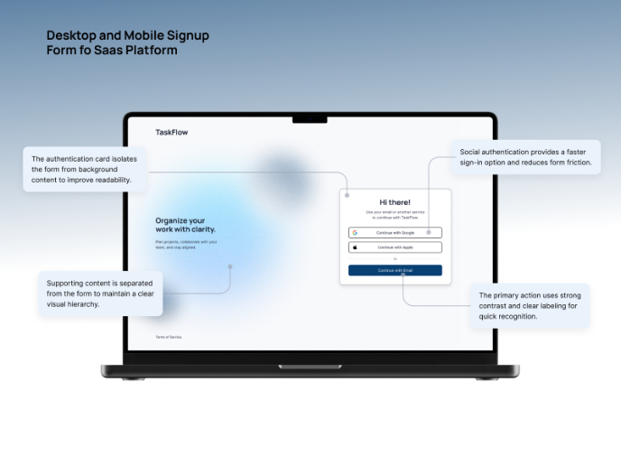
TaskFlow Authentication Flow
This project presents an accessible authentication flow designed for a SaaS platform called TaskFlow. The interface was designed with WCAG 2
Project
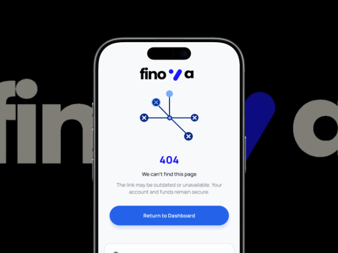
Helpful 404 Error Page for a Fintech Mobile App
Project ContextError pages are often overlooked in product design, yet they play an important role in maintaining trust and guiding users wh
Visual Design Courses

Course
UX Design Foundations
Learn UX design fundamentals and principles that create better products. Build foundational knowledge in design concepts, visual fundamentals, and workflows.

Course
Introduction to Figma
Learn essential Figma tools like layers, styling, typography, and images. Master the basics to create clean, user-friendly designs

Course
Design Terminology
Learn UX terminology and key UX/UI terms that boost collaboration between designers, developers, and stakeholders for smoother, clearer communication.


