Entertainment Platform: Cyberpunk Game Launch Landing Page

For this project, I decided to design a typography system for a landing page promoting a cyberpunk-style game. The cyberpunk genre is known for its high-tech, neon-lit aesthetics combined with dystopian themes, making typography a crucial element in establishing the mood.
A successful landing page for such a game should:
- Immerse users in the theme through a bold, futuristic, and high-tech visual style.
- Maintain readability and hierarchy while delivering an engaging, high-impact experience.
- Support accessibility by ensuring good contrast and legibility across different screen sizes.
Typography System for a Cyberpunk Game Landing Page
1. Choosing the Entertainment Platform
For this project, I decided to design a typography system for a landing page promoting a cyberpunk-style game. The cyberpunk genre is known for its high-tech, neon-lit aesthetics combined with dystopian themes, making typography a crucial element in establishing the mood.
A successful landing page for such a game should:
- Immerse users in the theme through a bold, futuristic, and high-tech visual style.
- Maintain readability and hierarchy while delivering an engaging, high-impact experience.
- Support accessibility by ensuring good contrast and legibility across different screen sizes.
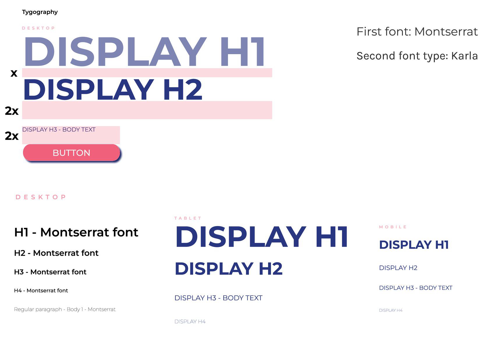
2. Typography System Development
I created a five-level hierarchical typography system to ensure clear information prioritization and maintain a dynamic, engaging layout. The selected typefaces were chosen to reflect the cyberpunk aesthetic while balancing readability and accessibility.
Typeface Selection
For this project, I chose the following fonts:
- Primary Typeface: Saira Stencil One
- A bold, high-tech stencil font that aligns with the cyberpunk theme.
- Gives a futuristic and digital feel, reminiscent of industrial signage or hacking interfaces.
- Works well for headers and attention-grabbing text.
- Secondary Typeface: Inter
- A highly legible, modern sans-serif font.
- Complements the primary typeface by ensuring excellent readability in paragraphs and smaller UI text.
- Offers flexibility for different weights and styles.
Rationale:
The largest and most striking text on the page. The stencil-like nature of Saira Stencil One makes it feel mechanical, tech-heavy, and in sync with the cyberpunk atmosphere.

Reviews
0 reviews
You might also like

SONZ - Entertainment platform


Camp & Travel Explorer - App Design


Solar system Dashboard Utility

Uxcel Halloween Icon Pack


Signup page for a SaaS website


Color System

Visual Design Courses

UX Design Foundations


Introduction to Figma

Design Terminology
