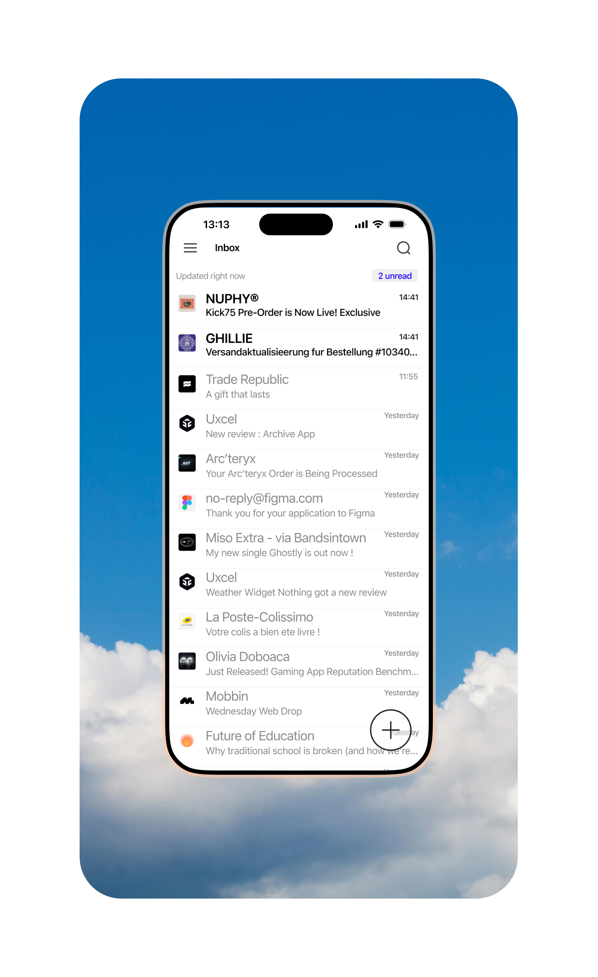
Rework Proton Mail
I’ve always felt that Proton Mail’s “New Mail” button wasn’t ideally placed—it’s too high on the screen, making accessibility difficult. So, I decided to do a slight redesign, adding a more accessible button that’s easier to reach with one hand.
This exercise also gave me the opportunity to experiment with rebuilding an interface.
Tools used
Share
Reviews
1 review
Hey! This is a good starting point! But i believe yiur design could benefit from a little more breathing room. 🤔 Try adjusting the spacing and padding to declutter the layout and improve readability.
For the floating button, a solid, contrasting background would make it much more visible.
2 Claps
Average 2.0 by 1 person
You might also like
Project
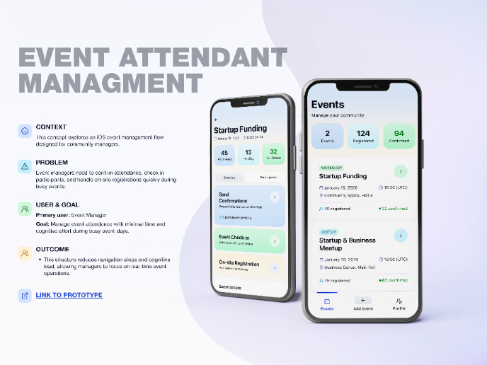
Events Managment App
🔹 Project OverviewEvent Management Tool (iOS) UX/UI concept for business community event managers This project focuses on designing functio
Project
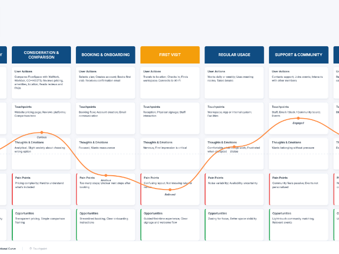
Customer Journey Map — Offsite Co-Working Experience
Structure explanation: The journey map is organized horizontally by seven experience stages, moving left to right from Awareness & Discovery
Project
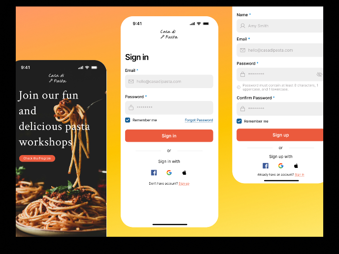
Mobile Onboarding: Casa di Pasta
🍝 Project Overview: Casa di PastaThis project is a mobile registration and login flow for a pasta workshop app. My goal was to create a fri
Project
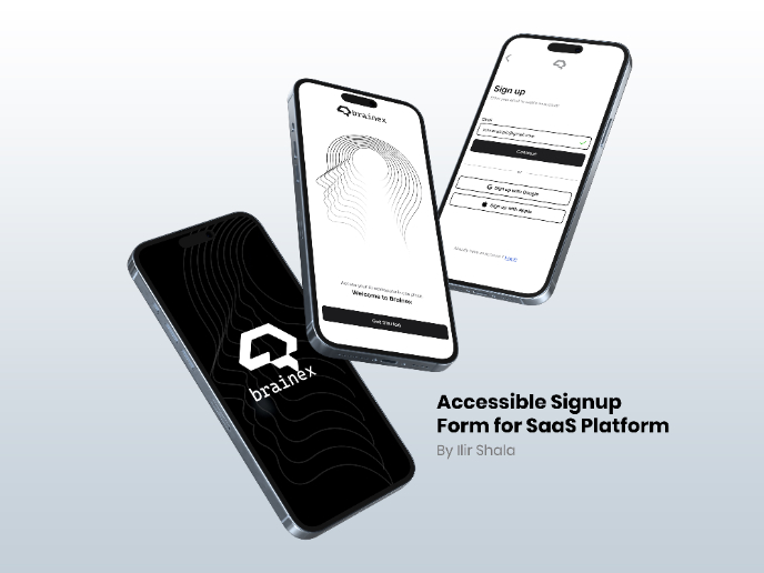
Accessible Signup & Login Experience — Brainex
Accessible Signup & Login Experience — Brainex Brainex is a modern and accessible authentication experience designed for a SaaS platform. T
Project
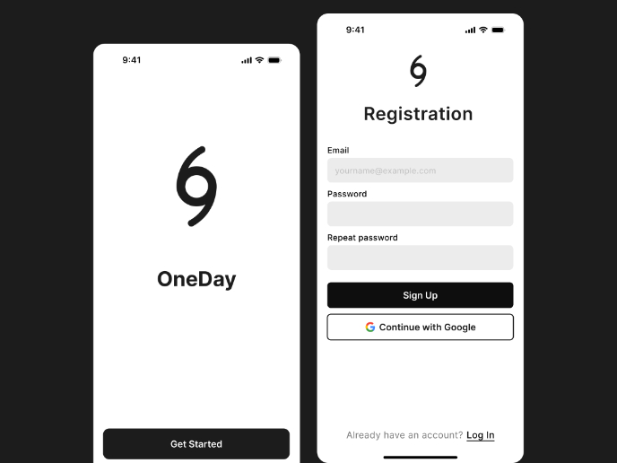
Accessible Signup Form
Accessible Sign-up Form for Mobile Apps ✔️ State-based Form Validation Primary actions remain disabled until all required fields are comple
Project
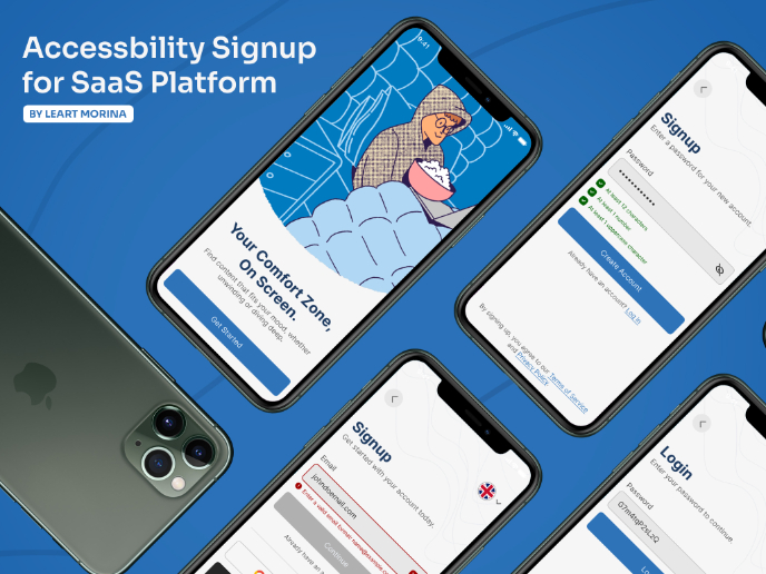
Accessible Signup Form
This project is an app which helps users to consume content based on their mood and it explores the design of an accessible, inclusive signu
Popular Courses

Course
UX Design Foundations
Learn the essentials of UX design to build a strong foundation in core principles. Gain practical skills to support product development and create better user experiences.

Course
Introduction to Figma
Learn essential Figma tools like layers, styling, typography, and images. Master the basics to create clean, user-friendly designs

Course
Design Terminology
Learn UX terminology and key UX/UI terms that boost collaboration between designers, developers, and stakeholders for smoother, clearer communication.
