
Reviews
1 review

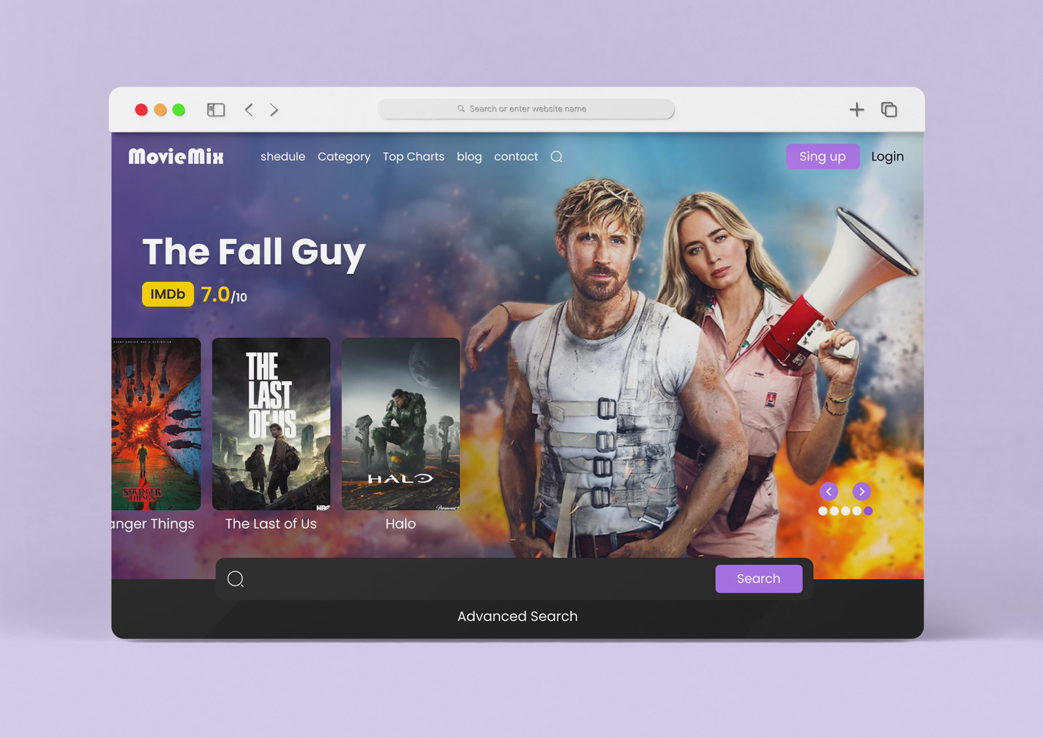
This movie page uses great visuals to really sell the idea of action, entertain and fun. The movie posters add engagement and make the user want to click and view them further. The IMDb rating is a great addition because its a well-known and trusted source for movie reviews.
Things you might want to have another look at, with the links in the navigation check the spelling, I do spot a few errors, and also keep the sentence case consistent. 'blog' and 'contact' start with lower case with 'Category' and 'Top Charts' start with higher case letters. Also lean on common design patterns to help make decisions on things such as where to place the carousel directional buttons. The way it looks now, I'm not sure if its going to change the header image or if its going to scroll through the list of movies in the bottom left. You also have a search bar at the bottom in the middle, which is not a common place to find it, and you also have a search icon at the top. I wonder why you have the two?
Overall, its a nice visually engaging page with straight forward navigation, but I'd tidy up a few things to get it more consistent across the board. Nice work!
You might also like

eWallet App Development Project

Design a 404 Error Page

Uxcel Halloween Icon Pack


Color System

Duolingo Halloween Icon Pack


Website CRM Dashboard

Popular Courses

Design Terminology


Core UI Components


Enhancing UX Workflow with AI