Mi Band 9 - Casual Watch
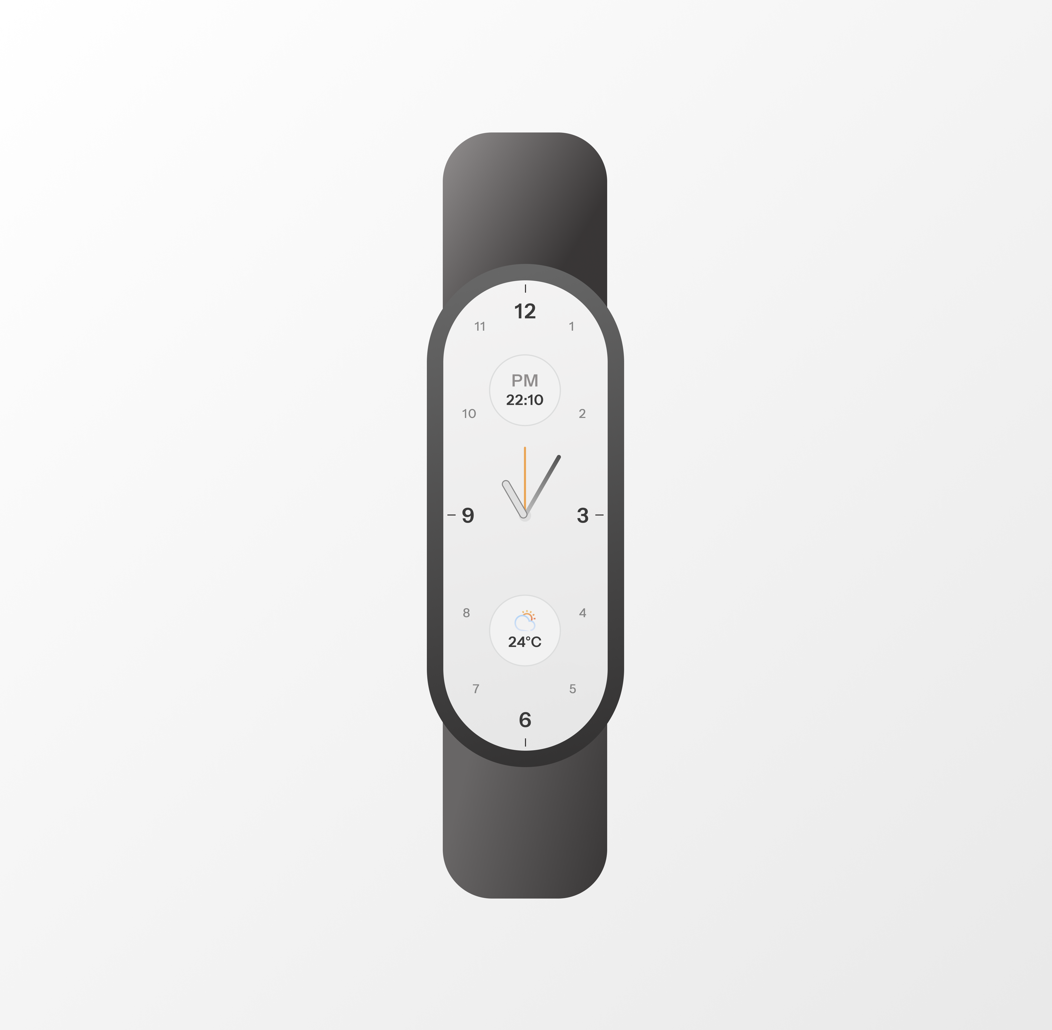
This is a passion project I made for Mi Band 9 UI.
Normally, people buy this product to:
- Track wellness status (heart rate, calories burnt, steps taken,...)
- Create goals to encourage workouts
It all started when my wife bought a band for me as a Christmas gift, and I only focused on 2 main tasks:
- Keep track of time
- Watch weather status
- Replace a traditional watch
With inspiration from Braun product design, I created a theme where it allows me to:
- Be informed of the current time, and whether it is PM or AM
- Know what the current temperature and weather status
- Enjoy a minimalistic interface with a model of traditional watches
Reviews
5 reviews
Hi Nguyen.
Here’s an improved version of your text with a more concise, polished tone:
You’re a fantastic storyteller, which is an excellent way to start a case study. However, one visual doesn’t fully support your narrative. Expanding the visual component to align with your story could provide more context and enhance understanding. For example, you could include a current screen with annotations highlighting what you, as a user, found irrelevant or challenging to use.
Additionally, showcase visuals of your inspiration—like the Braun product—and explain how you transformed that inspiration into a valuable watch interface. Highlight how these changes make it more practical and user-friendly from your perspective.
Being inspired and driven by your passion is always the key to creating outstanding solutions. Great work! Keep it up!
Yuliia
Great work on the Mi Band 9 UI! The minimalistic design inspired by Braun feels clean and user-friendly. I like how it focuses on practical features like time, weather, and fitness tracking.
To improve, you could explore adding subtle animations or customizable themes to make it more engaging. Overall, it’s a sleek design that balances functionality and simplicity nice job!
Nice effort mate, but if we consider accessibility, this won't be possible for user to view any text. Please consider going through this awesome Uxcel's lession I link below. Hope to see your next work.
https://app.uxcel.com/courses/mobile-design/design-for-wearables-456
Really like the UI of watch, one suggestion can be implemented, font size of 12 and 6 could be improved for adding some playfulness in UI, it will also enhance better readability.
Ui is nicely done
You might also like
Blip - Esport app design (Light & Dark UI)
Reimagining Asana's Color System

Customer Journey Map for a Co-Working Space

Responsive Main Screen
Latios - Free Portfolio Template for UX/UI Designers
Workspace Booking Flow - UI/UX Design
Popular Courses

UX Design Foundations

Introduction to Figma


