JustTrack Color System

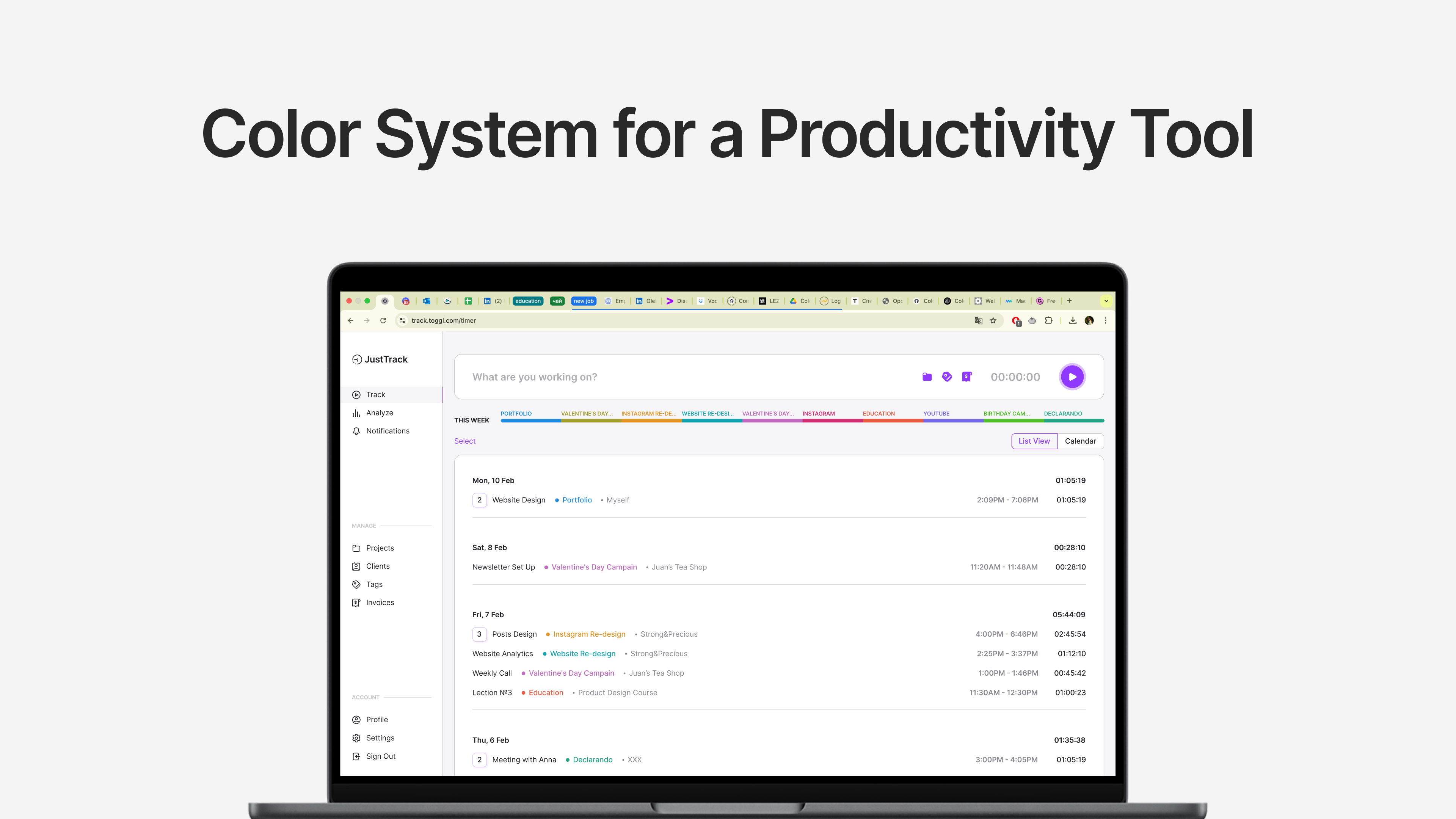
The goal was to build a color system tailored for a productivity tool that supports productivity and clarity. I chose ToggleTrack as the base and briefly re-designed the web version of it.
In the following slides you’ll discover:
Primary colors — for buttons, key actions, and highlighted states;
Secondary colors — to distinguish different types of time entries, projects, or workspaces;
Neutral colors — to form the foundation of the interface;
System colors — to communicate status and feedback.
I verified contrast using WCAG standards to ensure readability, especially for key interactive elements and text.

Reviews
1 review

Beautiful work Oleksandra! Well done on verifying contrast compliance. The colors fit perfectly on both light and dark mode. Nothing seems to clash and I appreciate your words on the thought process behind this project.
You might also like

SONZ - Entertainment platform


Camp & Travel Explorer - App Design


Solar system Dashboard Utility

Uxcel Halloween Icon Pack


Color System

Duolingo Halloween Icon Pack

Visual Design Courses

UX Design Foundations


Introduction to Figma

Design Terminology
