iTV - Stream Anywhere Anytime - Low Fidelity Wireframe for streaming mobile app

iTV is a streaming app that allow users to stream their favourite show anywhere and anytime. In this project I created low fidelity wireframe for their mobile app.
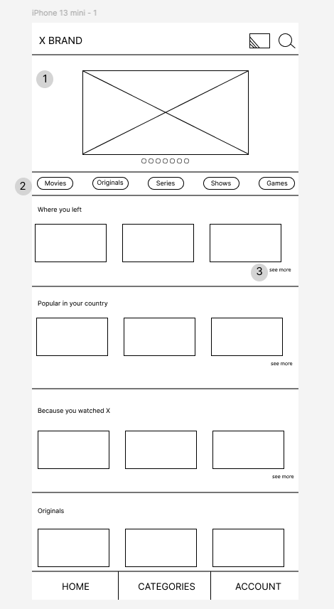
1) At the top we are seeing brand name and on the top left corner there is a Connected TV streaming and search button vector
2) There is a tab to direct users to the genre they are looking for, they can custom their experience by clicking the category button they are looking for.
3) If the users want to see more content on the one of the titles they just need to they can swipe left the cover of the content. To show this I just typed see more here.
4) I created 4 subcategories to ease the users' job to help them find what they want to watch: Where you left, Popular in your country, Because you watched X and Originals
5) In the footer, there is home button where they can go back. Categories: to provide extensive category labeling and Accounts: where they can find settings.
Tools used
From brief

Topics
Share
Reviews
1 review

Hey Ozgun,
Nice work on completing your design brief!
Unfortunately, this project doesn’t quite meet the requirements, as it closely resembles the existing Netflix UI rather than exploring a unique approach to usability. The brief asks for innovative ideas to differentiate the service.
To improve:
- Try brainstorming unique features that enhance the streaming experience.
- Focus on usability improvements—what pain points could you solve?
- Use Balsamiq for low-fidelity wireframes—it helps refine structure and functionality without getting caught up in visuals.
Looking forward to seeing more of your work!
You might also like

Beautify Login page WCAG principles


edX Sign-Up Page Redesign


Design Prioritization Workshop


Notion Login Page Accessibility Optimization


Sanyahawa - Landing page Design


Healthy Dashboard

Interaction Design Courses

UX Design Foundations


Introduction to Figma

Design Terminology
