HoneyBook Sign Up page - Redesigning for Accessibility Compliance

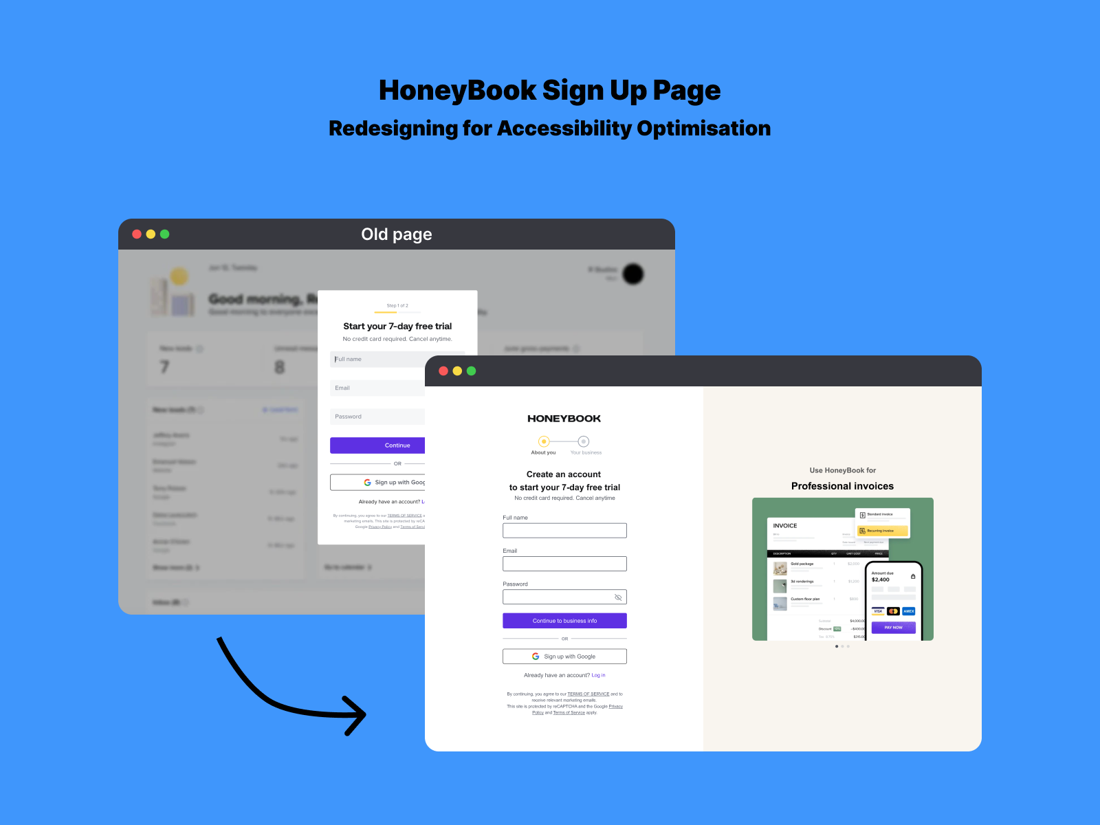
I came across the HoneyBook Sign Up page and noticed that although some aspects were great in terms of accessibility, like the password guidance, some things could be improved. The form lacked Form labels, clear field borders, and an active state.

Reviews
2 reviews

First off, your analysis of the original login page is spot-on. Small spelling error, I think you meant to say "Tiny 10px font" and not "Tine 10px font" - but thats just me nitpicking. I like that you kept the elements that did work because some might be tempted to redesign those! Your redesign is much clearer and cleaner and the step 1 and 2 is now so much more understandable. User expectation can be met. The form labels are so so important so I am glad that you caught that. The error and focus states being clearer is also a great win for accessibility. Nice work articulating the decisions so well and making a new design that works for all users.

Good work on enhancing the signup page for the SaaS platform! I appreciated your meticulous attention to detail, particularly with the clear focus states and smooth autofill functionality, which significantly boost the form’s usability.
You might also like

edX Sign-Up Page Redesign


Beautify Login page WCAG principles


Design Prioritization Workshop


Sanyahawa - Personal Portifolio_login page

Uxcel Halloween Icon Pack


eWallet App Development Project

Visual Design Courses

UX Design Foundations


Introduction to Figma

Design Terminology
