Color System - Asana


Reviews
3 reviews

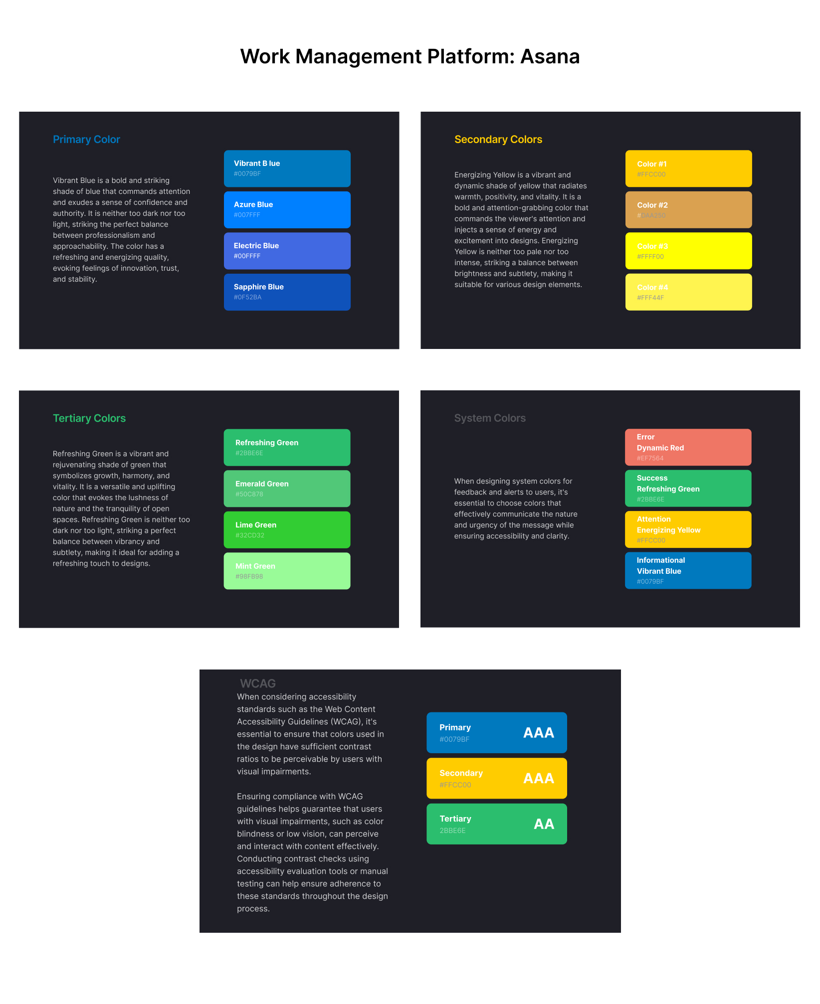
Although you've named the presentation as a color system for Asana, the descriptions for each color palette do not directly tie to Asana or their brand values, they sort of generally talk about what the colors mean but not really connected to their brand.
For WCAG accessibility compliance, you have presented some general messaging of guidelines but have not shown the contrast ratios. This may be helpful to include.
In your presentation of the color palette, the text color on the palette colors gets washed out and is illegible, hard to read. See your secondary yellow color palette as an example. Notably, you are missing some other colors in your palette like text colors, which are important to showcase with the accessibility options, and with UI element examples. Make sure to show examples of how your color palette is applied to brand elements and UI elements, and make sure to include a more comprehensive description of your design choices.

Your effort to revamp the color system for Asana is commendable, but some areas require attention to ensure alignment with brand identity and usability.
Your selection lacks a direct tie to Asana's brand values and identity.
While you acknowledge the importance of WCAG compliance, the presentation lacks evidence of contrast ratios, which are crucial for accessibility. Additionally, some color combinations, such as white text on a green background, may raise concerns regarding readability, especially for users with visual impairments. Your presentation suffers from readability issues, particularly with text color against palette colors.
It seems there might be some confusion in the color choices, particularly with the overlap between primary, secondary, and tertiary colors with the system colors.
You've nailed it with your choice of colors for the work management tool! They really capture the essence of what users would expect and add that extra touch to elevate the user experience.
I appreciate that you mentioned the importance of compliance with WCAG, but I couldn't find evidence showing that the selected colors meet accessibility color contrast requirements. Especially with the white text against a green background, I'm a bit concerned about whether there's enough contrast, particularly with thinner typefaces.
Also, if you could demonstrate how these colors harmonize within an interface, it would really drive home their compatibility and practicality.
Overall, great work!
You might also like

Beautify Login page WCAG principles


edX Sign-Up Page Redesign


Design Prioritization Workshop


Notion Login Page Accessibility Optimization


Sanyahawa - Landing page Design


Healthy Dashboard

Visual Design Courses

UX Design Foundations


Introduction to Figma

Design Terminology
