My First Scalable Button System

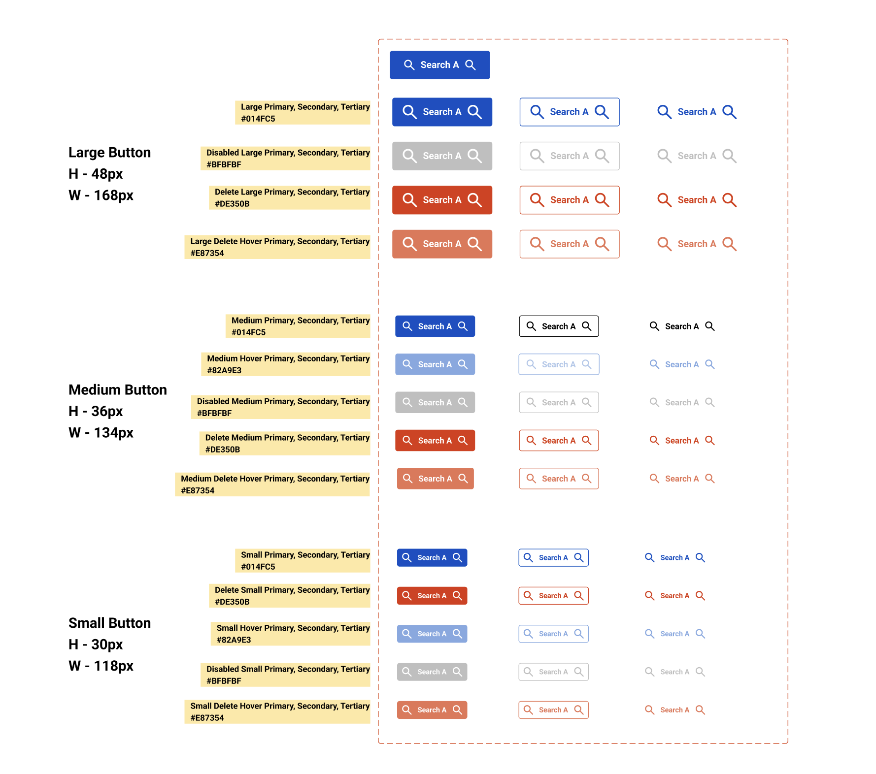
The Button System demonstrates a thoughtful and structured approach to user interface (UI) design. With this system, I wanted to establish a consistent and scalable component library that addresses various user needs. I think this system will help create a good user experience and an easily maintainable design system.
My thought process while creating this button system:
1. Standardisation and Consistency
- My Thought: I created this to bring a consistent look and feel across the application or website. It will help reduce cognitive load for the end user as they will learn how a button functions in one place and can apply that understanding everywhere else. A standard and consistent button system makes any website or application look well thought out and professional.
- My Decision: I have ensured to define a clear set of buttons based on different sizes and states. This will standardise the look and behaviour of the buttons regardless of where they are used in an application.
2. Hierarchy (Primary, Secondary, Tertiary)
- My Thought: Not all actions are equally important. A user should be able to quickly identify the most critical action on a page. Using different visual weights helps guide the user's attention.
- My Decision:
- Primary: The most important action. In system, this is represented by the solid blue button (#014FC5). I have chosen this color for its high contrast and association with common "call to action" buttons (e.g., "Submit," "Save," "Buy Now").
- Secondary: An important but less critical action. This is represented by the outline button with a blue border. It draws attention but is visually subordinate to the primary button. This will be used for actions like "Cancel" or "Learn More."
- Tertiary: The least prominent action. This is represented by a simple text link with an icon. It's for low-priority actions that shouldn't distract the user from the main task (e.g., "Dismiss," "More Options").
3. State Management
- My Thought: Users need feedback to understand if an element is interactive and what will happen when they interact with it. Button states provide this crucial feedback.
- My Decision:
- Default: The standard, ready-to-be-clicked state.
- Hover: The state when the user's cursor is over the button. The color change (e.g., the primary button's background changes to a darker blue or the hover state for delete becomes a lighter red) signals that the button is interactive and about to be clicked.
- Disabled: The state for an action that is not currently available (e.g., a "Submit" button is grayed out until all required form fields are filled). The gray color (#BFBFBF) and reduced opacity clearly communicate that the button is non-functional, preventing user frustration from clicking something that doesn't work.
- Delete/Destructive: This is a special, high-impact state. Using a distinct color like red (#DE350B and its hover state) is a critical decision. It serves as a visual warning, prompting the user to be careful before proceeding with a destructive action like deleting an account or a file.
4. Scalability and Responsiveness (Size Variations)
- My Thought: Buttons need to work in different contexts and on different screen sizes. A single button size won't fit a complex form, a mobile view, and a large hero section equally well.
- My Decision:
- Large Button (H-48px, W-168px): Designed for high-visibility areas like hero sections, major call-to-action buttons, or on desktop interfaces where more space is available. The larger size makes it easier to click and visually prominent.
- Medium Button (H-36px, W-134px): A good, all-purpose default size for most UI elements, such as within forms or standard tables.
- Small Button (H-30px, W-118px): Ideal for confined spaces, dense tables, or on mobile interfaces where screen real estate is limited.
From brief

Share
Reviews
4 reviews

Great start! Your button system is well-structured and consistent, which is a solid foundation. I’d recommend adding clicked and focused states as well. These give users clear feedback that their interaction was successful, and they’re especially important for accessibility and keyboard navigation.
On the larger buttons, the icons feel a bit oversized. Right now, they’re pulling attention away from the text instead of supporting it. Ideally, icons should complement the label, not compete with it. Reducing their size slightly will help keep the focus where it should be — on the action itself.
For the hover states, I’d suggest making them slightly darker rather than lighter. This usually works better because a darker shade increases contrast and creates a stronger sense of depth, which reads more clearly as “clickable” on most screens. Lighter hover states can sometimes feel like disabled buttons, depending on the palette, so it’s worth testing to make sure the interaction feels intentional.
Keep up the good work!

Great work, Shashikant! Your button system is thoughtfully structured, with clear attention to hierarchy, scalability, and user feedback. To improve further, consider checking contrast ratios and touch target sizes for accessibility, especially on smaller buttons. Overall, a solid foundation for a maintainable and user-friendly design system—well done!

Great work on the button system, I love the consistent scaling across sizes but one key element to improve is accessibility, particularly the color contrast and tap target size, Additionally, consider adjusting the size of the icon within the buttons to ensure it scales appropriately
Keep up the solid effort 👍

Amazing, keep it upp..
You might also like
SiteScope - Progress Tracking App


CJM for Co-Working Space - WeWork

Ubani Design System

Accessible Signup Form for SaaS Platform
Loginino

Notification microcopy - Project

Visual Design Courses

UX Design Foundations


Introduction to Figma

Design Terminology
