Help users recognize, diagnose, and recover from errors
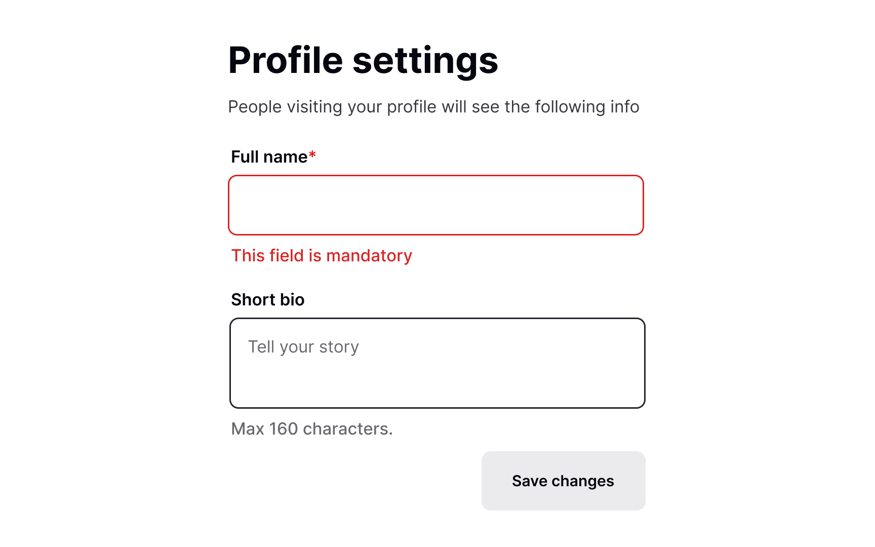
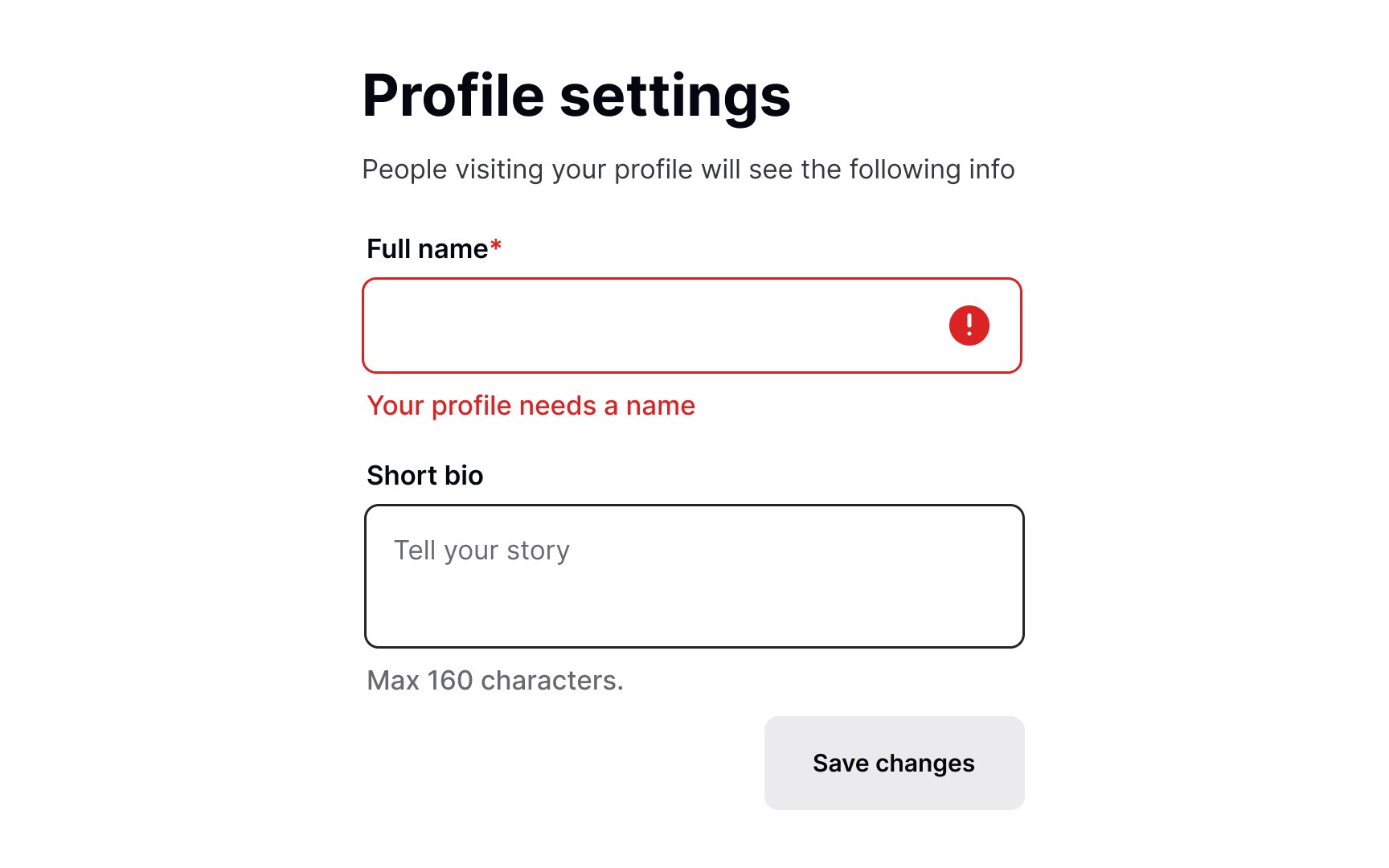
Error messages should be written in plain language and explain briefly what caused an error and how users can fix it to continue with their flow.
Avoid showing error codes and explaining the mistake in technical jargon — it says nothing to users, intimidates them, and makes them feel stuck.
The criteria for a good error message include:
- Plain, human language: The primary goal of an error message is to inform users, not impress them with sophisticated, complicated words. You may use technical terms only if you're confident your audience is familiar with them. In general, stick to everyday words.
- Politeness: Make sure your message doesn't sound judgemental or imply that users have done something wrong.
- Explicitness: The message should clearly explain the cause of the error.
- Constructive advice: Just stating the problem isn't enough. Explain how users can quickly solve the problem with less effort.
- Reduce users' work: For example, allow users to only fix inputs with errors instead of forcing them to fill the entire form again.[1]
Pro Tip: Error messages should be visible — use bold text, the color red, and a relevant icon.
