Consider font stress
The direction of stress in a typeface can have a remarkable effect on the mood of that typeface. For example, diagonal stresses feel down to earth, familiar, welcoming, and even invite users into the text. Vertical stresses, on the other hand, feel more refined and austere.[1] They work well for headings and large-scale types, but they can prevent users from really diving in to read the text at smaller sizes.
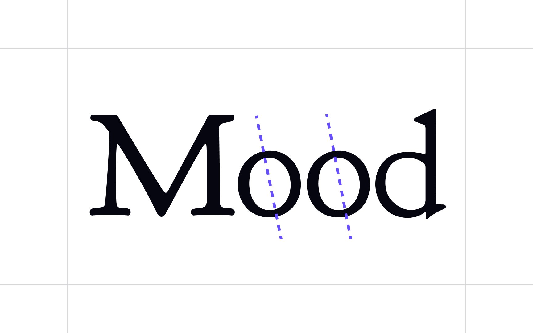
So how do you tell the direction of the stress in a particular typeface? The easiest way is to look at the letter O. If the two sides of the character are a mirror image of each other (particularly with the sides thicker than the top and bottom), then the stress is vertical. However, if the bottom left is thicker than the top left and the top right is thicker than the bottom right (or vice versa, although that's less common), the typeface has a diagonal stress.
References
- Brand typography: A complete guide | Creative Bloq
