Drop caps
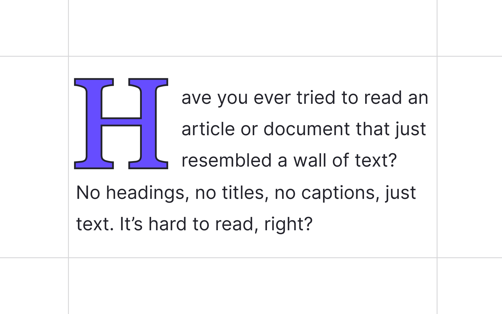
Before printed books were invented, manuscript writers used drop caps or versals — large, decorative initial letters — to mark the beginning of a new chapter or section. With the birth of printing, publishers continued adding hand-drawn drop caps to resemble hand-written manuscripts and increase the value of books.[1]
Nowadays, typographers and designers use drop caps to create an elegant, classic, and bookish look. Users encounter those enlarged decorative letters at the beginning of the first paragraph of an article, a book chapter, or a new section.
There are a few ways to place your drop caps so that they won't break the page structure:
- Place the drop cap on the same baseline as the text, setting the first words of the text block in small capitals to smooth the transition.
- Cut the drop cap into the text, allowing it to wrap around the letter.
- Place the drop cap beside the text, allowing it to hang out on the left margin without flowing into the text block.
Pro Tip: Don't use drop caps to mark each new paragraph. Instead, stick to indents, line breaks, or other visual cues.
