Design screenshots to demonstrate app value
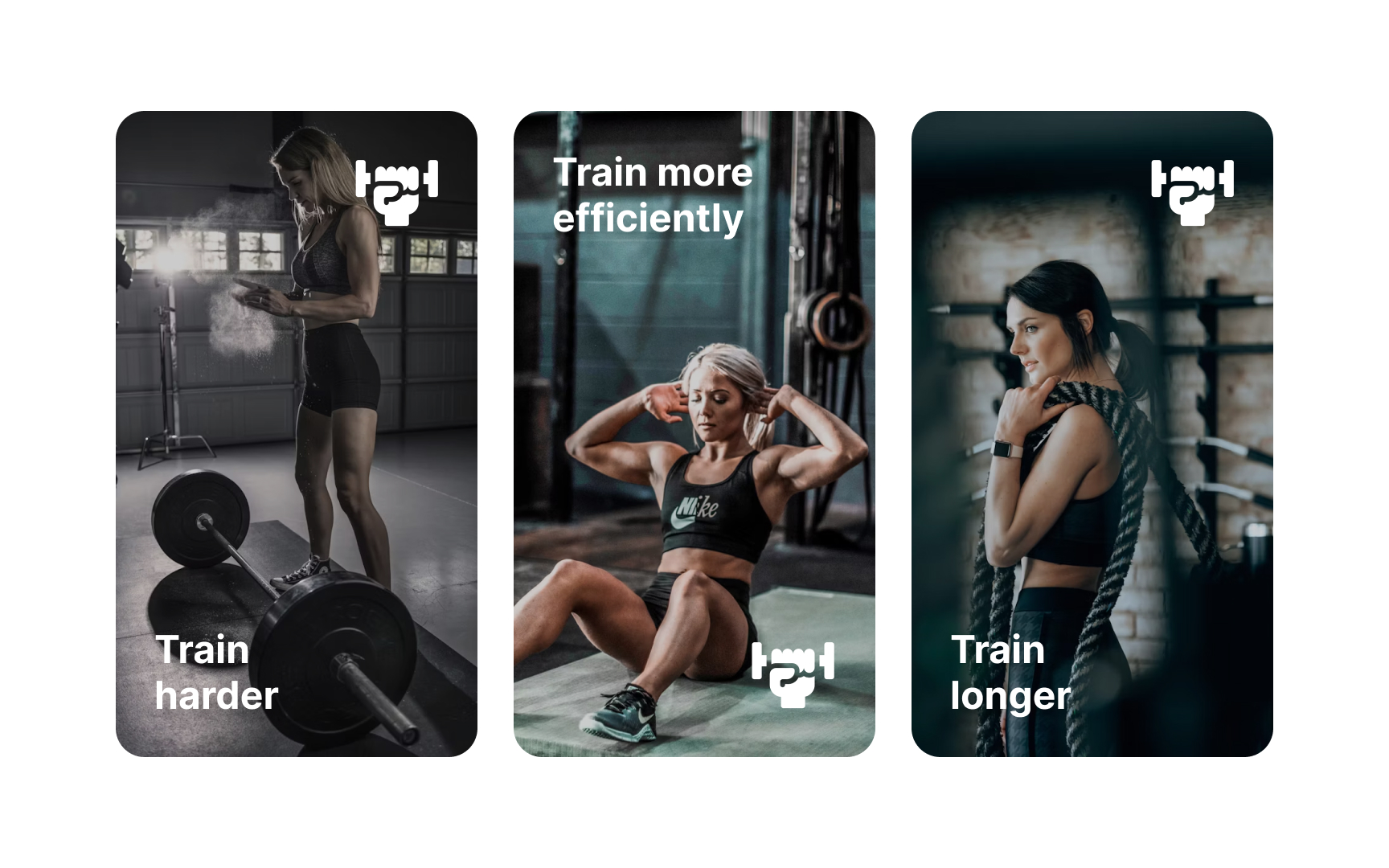
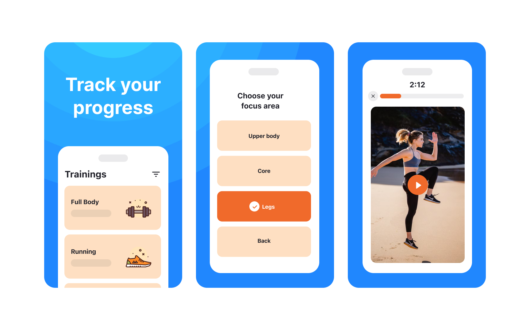
Screenshots are key to showcasing your app’s features and quality. They should clearly communicate your app’s unique value proposition. The App Store allows up to 10 screenshots, while Google Play Store permits 8. The number you need depends on your app type—e.g., a simple calculator may only need 1-2 images to highlight its core features.
Design tips for effective screenshots:
- Focus the first 3 screenshots on your app’s most important features, as these are the most viewed.
- Use high-resolution images with readable text, even in thumbnails.
- Avoid clutter: keep text minimal and ensure backgrounds don’t compete with content.
- Reflect your app’s current design and functionality.
- Avoid claims about rankings, awards, testimonials, pricing, or promotions (e.g., “#1,” “Best,” “Sale”).
- Skip call-to-actions like “Download now” or “Try now.”
- Don’t use time-sensitive content that may require frequent updates.[1]
