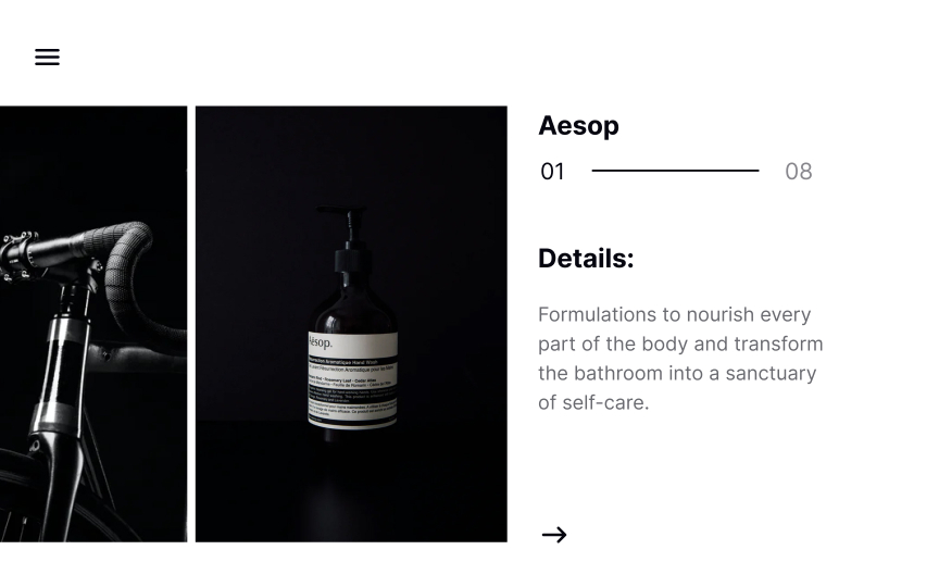
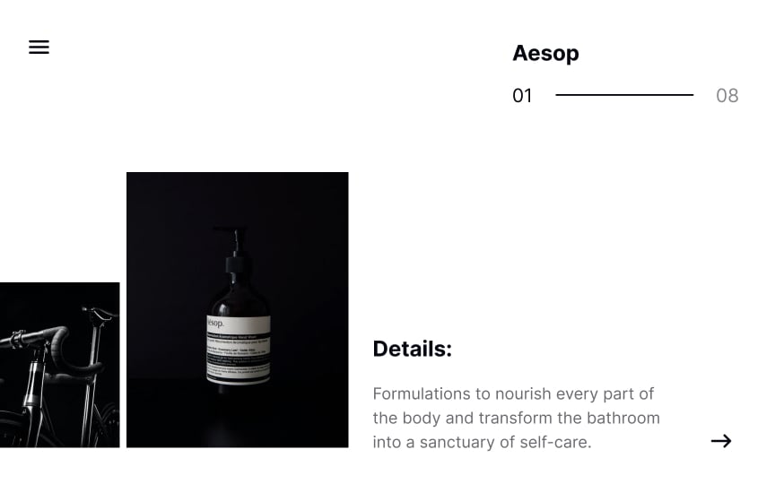
Position сontrast
Changing the position of elements on a page helps break up any monotony and keep users engaged.[1] What’s more, it guides attention to the most important element — a product image, for example — and makes the design more memorable.
Position within a composition can add (or subtract) visual weight to certain elements. Elements near the bottom of the composition will naturally appear heavier than those near the top.
Pro Tip: Aligning images and text to the bottom makes them look heavier in contrast with a "feather-light" title.
References
- Contrast Rule: Contrast Space & Position | The Visual Communication Guy


