Positive & Negative Space in Design
Understand the interplay between positive and negative space to create visually pleasing and well-balanced designs
Unlike other design elements that may or may not be present, space exists in every composition. Positive space includes the elements and areas of interest. Negative space is the area around these elements.
Some web creators might think that negative space has no purpose. Why not cram as much content as possible on the page? After all, that's what users come for. In reality, such designs are difficult to read, understand, and enjoy.
When applied correctly, negative space helps focus users' attention and contributes to a seamless user experience.[1] In fact, users won't even notice these blank areas. Instead, they will be able to focus on the important points and achieve their goals easily. The trick is to find the right balance of negative and positive space for your intended purpose.
Negative space works because of Gestalt principles.[2] Grouping elements is in human nature. We subconsciously arrange the elements we see into an organized system that creates a whole. Empty spaces in a
Pro Tip: In print, negative space is the white space around text and between lines. In UI design, it can be any color, or even a subtle pattern or texture.
If
Pro Tip: To make positive space stand out, ensure there's enough negative space surrounding it.
Pro Tip: Use active negative space to bring a specific element into the spotlight and encourage users to take action.
Passive
Pro Tip: Reducing passive negative space between a group of elements helps emphasize their direct relationship.
Many elements consist of positive space. A simple 2-dimensional geometric shape like the Heart
It's also possible to use
Increasing the space between paragraphs or headlines is an example of applying active
Passive
As designers, we should leverage both positive and
In the example, the
Active
In a simplistic design like this, it's important to separate
Active
As in many things, it's important not to go overboard. Too much active negative space can distract users and make them lose focus and interest.
Passive
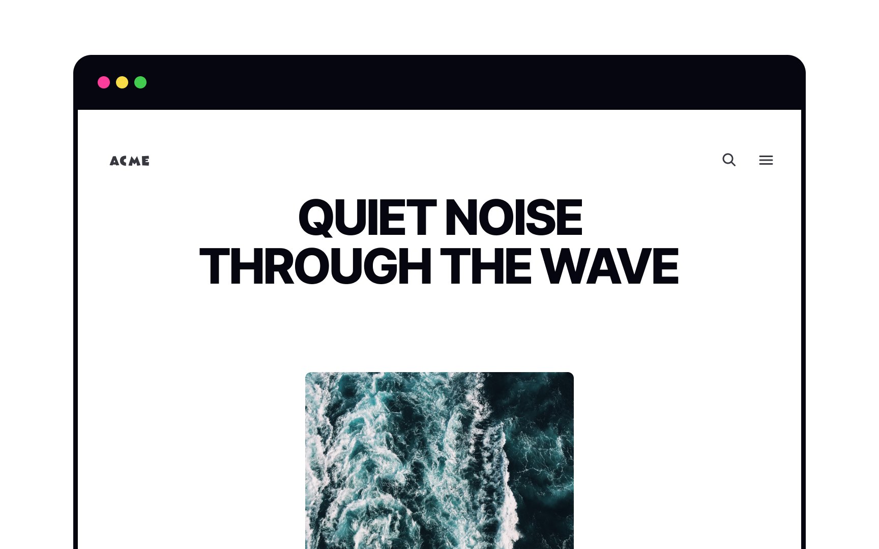
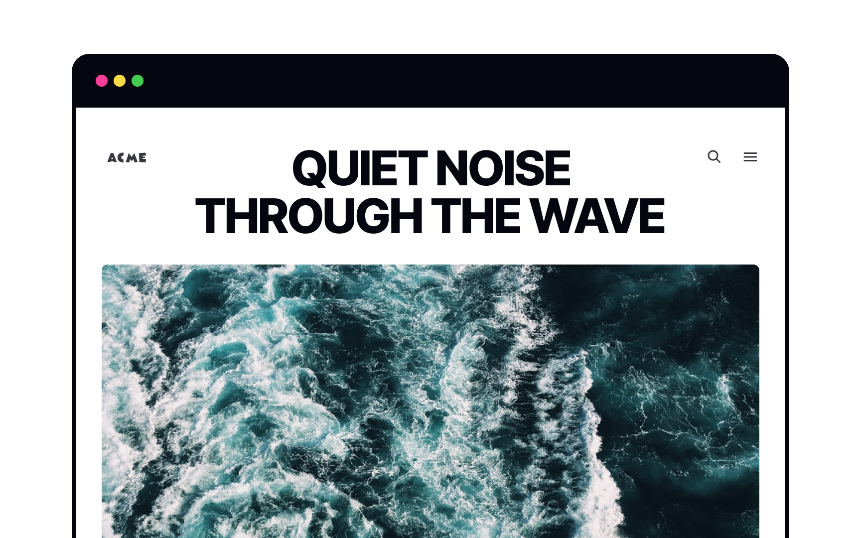
In the example, we identify the title and
References
- Effective Use Of Negative Space In Web Design - Usability Geek | Usability Geek
- 5 Principles of Visual Design in UX | Nielsen Norman Group