Negative space ensures legibility
Good typography is not only about positive forms but also the spaces between them. Internal negative space — for example, space between lines and characters — helps ensure that the text is legible.
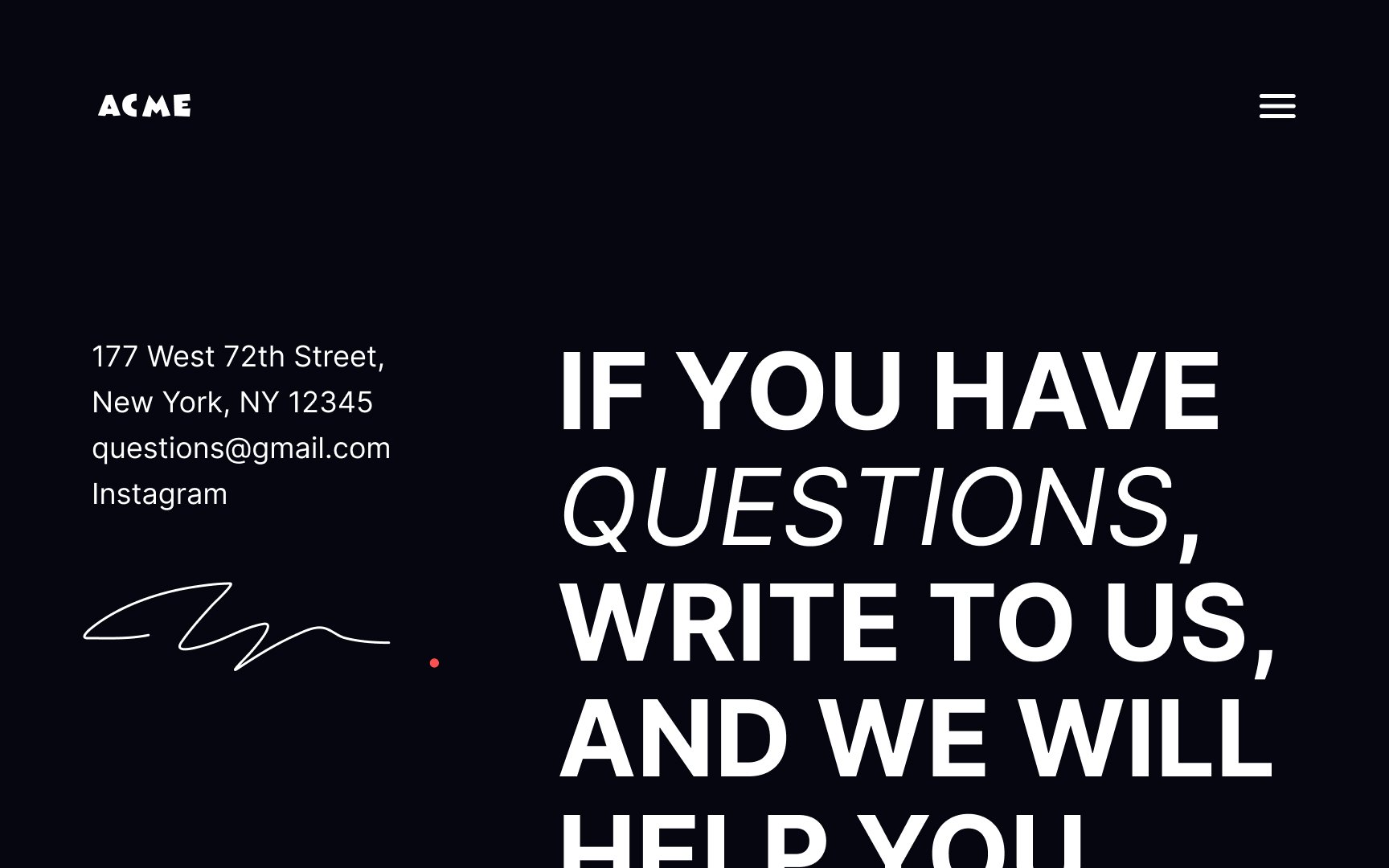
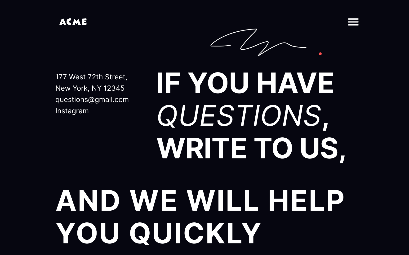
External negative space helps direct the flow of the page and establish hierarchy.[1] The space around the contact details draws users' attention to it. At the same time, the body text that flows around it emphasizes the connection between these 2 content groups.
Pro Tip: According to the web accessibility guidelines, the line spacing should be at least 150% bigger than the font size.
References
- Negative Space in Design: Tips and Best Practices | Tubik Blog: Articles About Design
