Color palettes in film & TV
In filmmaking, color is one of the most powerful tools used to express mood, evoke certain emotions, or convey a spirit of specific eras. Moreover, the best film directors have a recognizable style and color palettes that people associate with their movies.
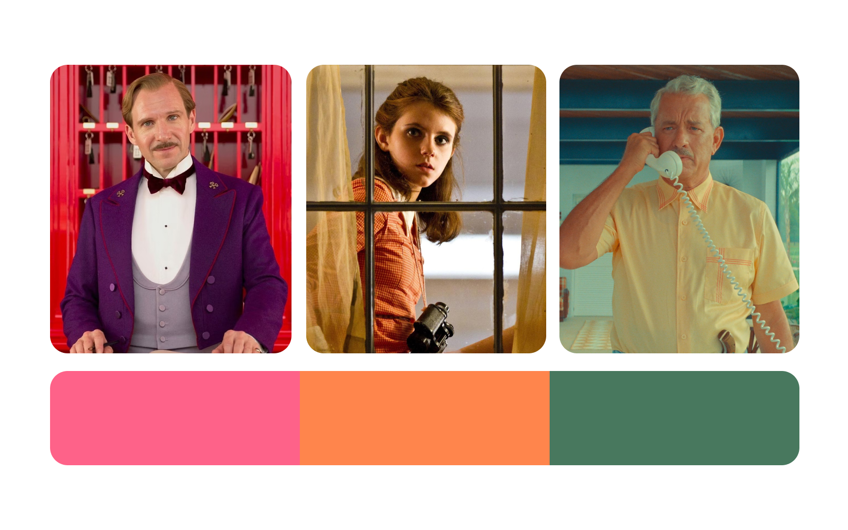
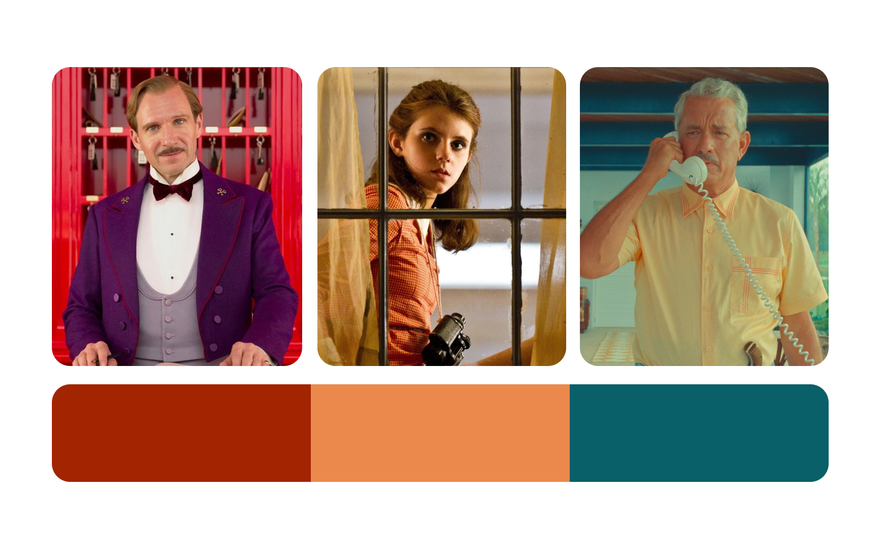
Wes Anderson’s warm browns, soft oranges, muted pinks, and gentle greens often feel dream-like and a bit nostalgic. The muted pink in The Grand Budapest Hotel and the hazy oranges and greens in Moonrise Kingdom help the cinematographer set a clear tone for the characters and shape the mood for viewers.[1]
People tend to associate romantic movies with consistently bright and more saturated colors. They feel more relaxed, safe, and eager to laugh seeing characters highlighted with cheerful light. Conversely, dramatic scenes are linked to melancholic dark or muted blue, green, black, or gray. Not to mention that heroes and villains can also be easily revealed by color.[2]
References
- Wes Anderson's Colour Palettes | AnOther
- Cinematographers and the Color Palette: The Impact of Color | Student Filmmakers Magazine
