Understand consumer perceptions
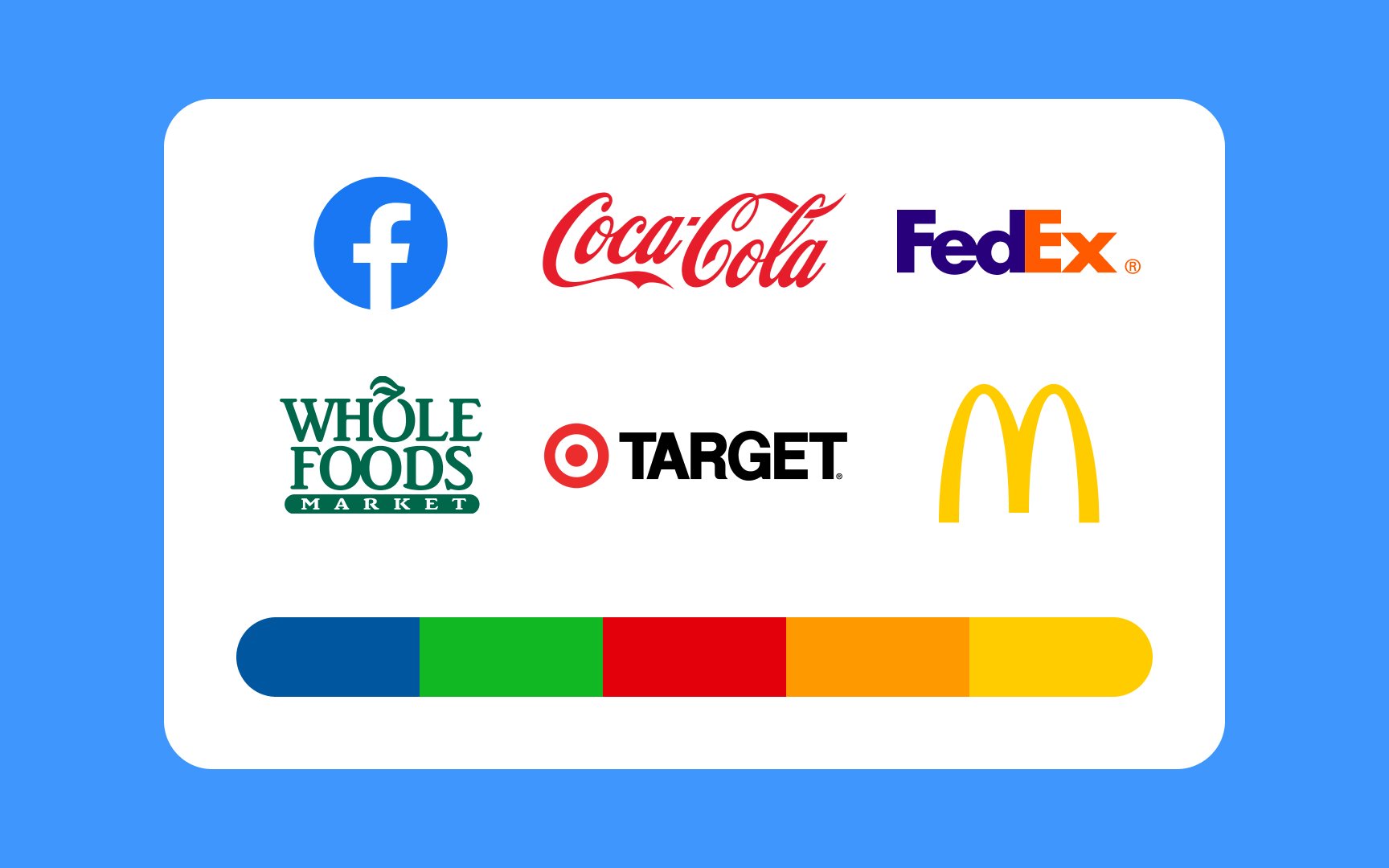
Color can dramatically affect users' perception of the design they're looking at. For example, blue is often linked to trust and calmness, which is why many banks and tech companies like Chase and Facebook use it. Red can create a sense of urgency and excitement, so it's used by brands like Coca-Cola and Target to grab attention. Green is associated with nature and health, making it popular with organic and eco-friendly brands like Whole Foods.
By understanding these color associations, you can create experiences that match the brand message and attract the right audience.
Top contributors