Using Color in Branding

Learn the role and influence of color in branding
Using Color in Branding Lesson

Color is one of the most powerful tools for shaping users' initial impressions of your product. In fact, depending on the product, people make up to 90% of their snap decisions based on color alone.[1]

As a designer, you may not always have the freedom to create a brand's color palette from scratch, especially if there are existing brand colors. However, understanding how to use additional colors effectively is crucial. The right color palette can transform a brand color that feels either too dull or overly flashy into something that aligns with the brand's values and conveys the desired message.

Understand consumer perceptions

Color can dramatically affect users' perception of the design they're looking at. For example, blue is often linked to trust and calmness, which is why many banks and tech companies like Chase and Facebook use it. Red can create a sense of urgency and excitement, so it's used by brands like Coca-Cola and Target to grab attention. Green is associated with nature and health, making it popular with organic and eco-friendly brands like Whole Foods.

By understanding these color associations, you can create experiences that match the brand message and attract the right audience.

Leverage emotional associations

Each color evokes specific feelings and associations. For instance, if you aim to convey tradition and formality, hot pink might not be the best choice. Hot pink is often associated with joy, enthusiasm, and playfulness. Instead, colors like navy blue or burgundy are more aligned with tradition and formality.

Also, keep in mind that colors can evoke different emotions across cultures, and it's important to consider these differences. In Western cultures, white is often associated with purity, peace, and minimalism. However, in many Eastern countries, white is associated with death and mourning. When choosing colors for a global audience, research the cultural associations thoroughly.

Pro Tip! Be cautious of inaccurate online references about color meanings. When possible, consult locals to verify the cultural significance of colors.

Enhance memorability

Choosing a color palette is just the first step in using color to establish a brand. Even the most strikingly original color palettes won't immediately have a brand association. That takes careful planning, implementation, and time. But by consistently using a color palette, it can become part of a brand's identity. A well-known example is McDonald's, which uses a red and gold color palette that has become almost immediately recognizable to consumers over the years.

To achieve this effect, use your chosen color palette throughout your brand and marketing materials. It should be incorporated into your website designs, social media graphics, logo, business cards, ads, and any other materials associated with your brand. Through consistent use and repetition, consumers will come to recognize your color palette and the values and personality it represents for your brand.

Bring out your brand personality Bad Practice
Bring out your brand personality Best Practice

To define your brand personality and align it with colors, start by identifying the core attributes of the brand. These attributes could be anything from trustworthiness, and innovation, to creativity, or energy. Once you have a clear understanding of these traits, you can begin to associate them with specific colors that naturally evoke these qualities. For example, a brand with a youthful, energetic personality might use vibrant colors like turquoise and magenta. On the other hand, a brand focused on professionalism and trust might use a color palette with navy blue and slate gray, conveying a sense of reliability and expertise.

Consider how the chosen colors work together as a palette. Incorporate various tones, tints, and shades to create depth and versatility within the color scheme. Neutrals can play a supporting role by helping balance the design and ensuring the more vibrant colors stand out without overwhelming the viewer.

Pay attention to the competition

Some colors have become closely associated with certain industries, such as red and blue for airlines. These colors are often used because they effectively communicate the industry’s values and appeal to the target audience. Red can convey energy and excitement, while blue is associated with trust and reliability — important qualities for an airline. However, you don't have to stick to the same colors in your branding. Consider why these palettes are common and whether they align with your brand's personality and goals.

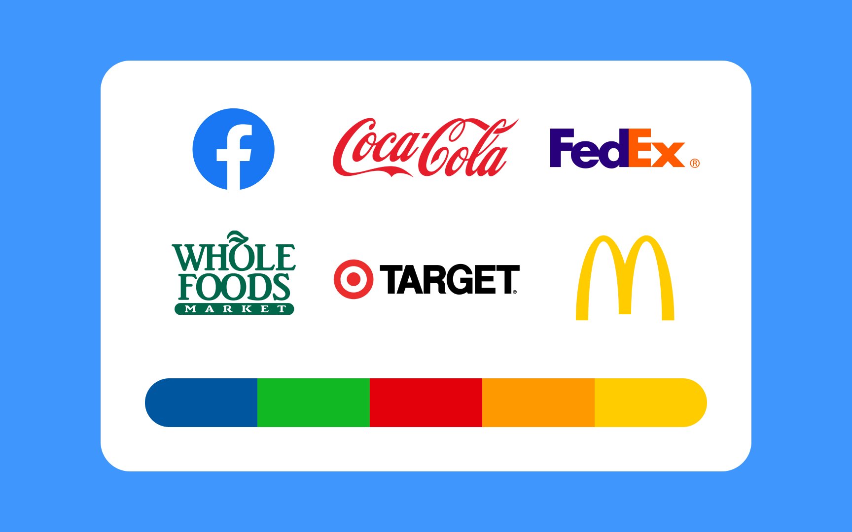
If you want your brand to stand out from competitors, choosing a unique color palette might be the right approach. On the other hand, using colors similar to competitors can signal that your brand shares similar values and adheres to industry standards.

Ultimately, the choice of colors should reflect the brand's identity and objectives while considering industry norms and consumer expectations. Balancing uniqueness with familiarity can help create a color palette that resonates with your target audience.

Keep it authentic  Bad Practice
Keep it authentic  Best Practice

By choosing colors that genuinely represent your brand, you can create a lasting connection with your audience.

To find authentic colors that align with your brand’s mission:

  • Start by understanding what your brand stands for. What emotions or qualities do you want to convey?
  • Look at other brands in your industry to identify commonly used colors, but make sure your choices reflect your unique message and not just trends.
  • Think about how your colors align with your company culture and the broader cultural context. Do they resonate with the values you stand for and the audience you want to reach?
Appeal to your audience Bad Practice
Appeal to your audience Best Practice

Different people have different reactions to colors, so understanding your audience can help you choose colors that appeal to them. For instance, if your users are adventurous and energetic, vibrant colors might resonate well. If your audience values calmness and relaxation, soothing and earthy colors could be more appealing.

Considering your users’ personalities ensures that your brand colors connect with them on an emotional level, making your brand feel more relatable and inviting. This connection can increase brand loyalty and make your brand more memorable to the people you want to reach.

Sometimes, sticking to traditional expectations and associations with colors can be the right and safe choice, especially if it aligns with the broader perceptions of your target audience. 

Differentiate your brand Bad Practice
Differentiate your brand Best Practice

Choosing the right colors can help your brand stand out while still meeting industry standards. To differentiate your brand, select colors that reflect your unique personality and values. This can set you apart from competitors and make your brand memorable.

However, it’s also important to incorporate colors that are familiar within your industry to signal trust and reliability. For instance, if you're in the tech industry, you might use the standard blue to convey trust and innovation but pair it with a vibrant accent color to showcase your brand’s creativity and modern approach. This ensures your brand is both distinct and aligned with industry values, making it appealing and trustworthy to your audience.

Complete the lesson quiz and track your learning progress.
Start
<?xml version="1.0" encoding="utf-8"?>