Reassuring users
Many studies show that natural environments with blue and green hues promote health, reduce stress, fear, and anger, and positively impact cognitive recovery.[1] In the early 1900s, a New York City psychiatric hospital even had different colored wards to treat different kinds of patients. Blue and green rooms were designed for boisterous individuals while red rooms were used to improve mood and ward off sadness.[2]
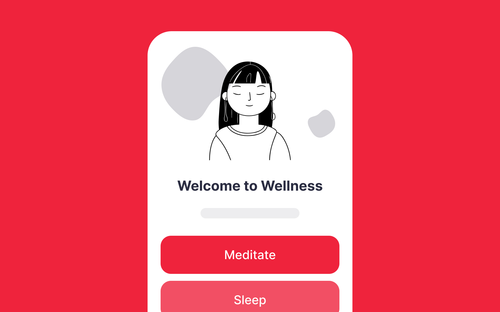
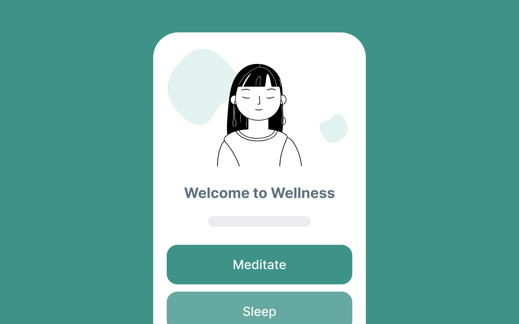
The right combination of soft blues and greens can be a perfect fit for situations where you need to calm and reassure users — for example, in meditation or yoga apps. These colors can also have a soothing effect on customers of banking or insurance apps.
References
- The Influence of Forest Resting Environments on Stress Using Virtual Reality | PubMed Central (PMC)
