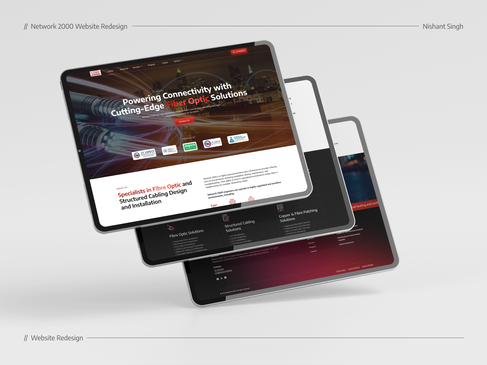
Website Redesign for Network 2000
This redesign focused on making information more accessible, visually appealing, and conversion-friendly.
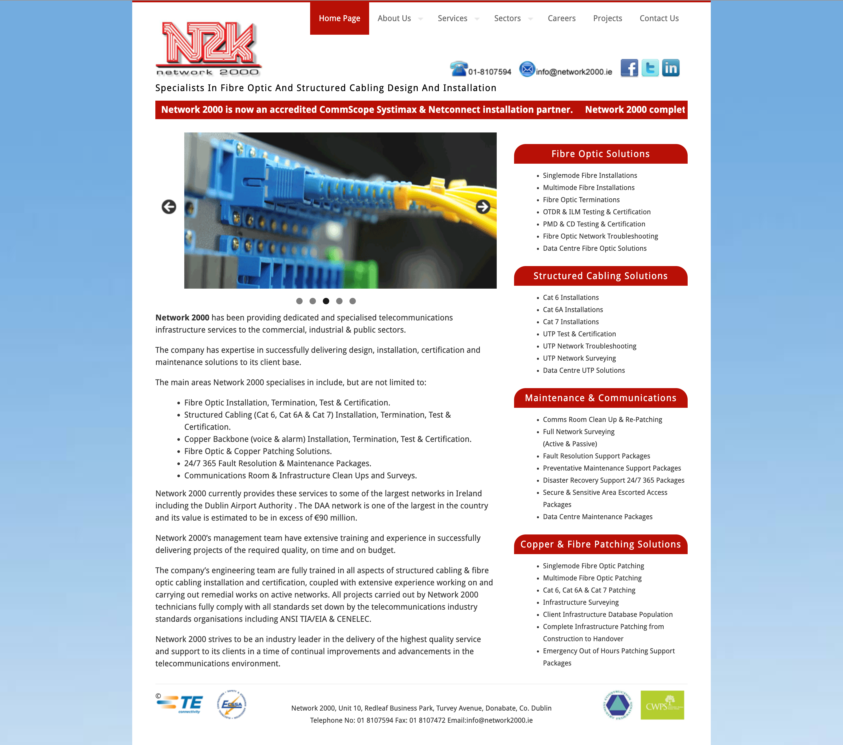
Old Website
Redesign
Reviews
4 reviews
Great job Nishant, you definitely brought a fresh and modern look to the website. Clear layout structure and good use of white space really works magic. I will however consider looking into the sections where there are texts on image backgrounds, especially the hero section. The background image seems too busy and distracting which might not help users get the relevant message.
Great effort on the website redesign!
Making information more accessible and visually appealing is a strong approach. Ensure that key content is easy to find and well-structured.
Check if the new design improves user navigation and conversions. Clear CTAs and a logical content flow will help.
A comparison of old vs. new design changes would highlight improvements. Keep refining for a better user experience!
Impressive to see how you are able to transform the website design from "engineering based" to the futuristic tech-savvy style. Awesome!
Here are a couple of issues coming to my mind:
- The accessibility design: are colors contrast acceptable by the accessibility request?
- Buttons shadows: would less shadows work better? Also there are other ways to illustrate the elevation of the buttons.
Overall, your redesign is brilliant.
Great job! You created a website that accurately personifies a networking company. Definitely feeling "the vibe".
However, the logo should be changed to reflect the website update. It's sort of sticking out like a sore thumb (if you don't mind the analogy 😁)
Other than that, this website remake is pretty sweet!
You might also like

Beautify Login page WCAG principles

edX Sign-Up Page Redesign

Design Prioritization Workshop

Notion Login Page Accessibility Optimization

Sanyahawa - Landing page Design

Healthy Dashboard
Popular Courses

UX Design Foundations

Introduction to Figma


