Vibeform Empty States

I decided to design empty states for my last Uxcel project (Create a High-Impact Landing Page).
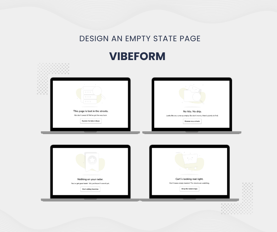
To stay visually aligned, I references a previous project (see image below) that helped define the mood, tone and color direction for this one. My goal was to carry out the same urban, clean and bold streetwear feel into each state.
During my research, I discovered a Figma file titled "Empty state illustrations freebies. The illustrations felt aligned with my visual direction, so I incorporated them into the project to bring personality and clarity to each state.
I maintained consistency by using the same typefaces throughout the design (From my previous project).
- Nunito for headings and subtitles, giving a friendly vibe.
- Roboto for button text, to ensure clean more modern look.
The project includes four different empty states, each tailored to common user interactions:
- 404 - Page not found
- Empty Search Results
- Empty Wishlist
- Empty Cart
To showcase the final designs, I used Canva to create clean, branded mockups for presentation.

Reviews
2 reviews

Hi Regína, looks like I’ll be doing the Vibeform review series too 😄
Okay, review one is in: the copy is sharp and playful, but the illustrations are leaning a bit too close to what we’d call low contrast? They feel a little washed out against the white background and almost disappear at a glance.
Maybe nudging up the color slightly or adding a soft container behind them could help them pop more, without losing the light and minimal vibe.

Great job, Regína! 👏 I like how you kept the branding consistent across all empty states — the urban, bold streetwear vibe really comes through, and the type pairing feels both approachable and modern. The way you matched the illustrations to the mood was also a smart choice, giving personality to what could otherwise feel like “blank” screens. One suggestion would be to adjust the contrast of the illustrations (maybe deepen the tones or place them on subtle containers) so they don’t get lost against the white background. Overall, really solid work — just a small tweak to make the visuals pop even more! 🚀
You might also like

edX Sign-Up Page Redesign


Beautify Login page WCAG principles


Design Prioritization Workshop


Notion Login Page Accessibility Optimization


Sanyahawa - Landing page Design


Healthy Dashboard

Content Strategy Courses

UX Writing


Common UX/UI Design Patterns & Flows


Building Content Design Systems
