Login Page for a SaaS Platform

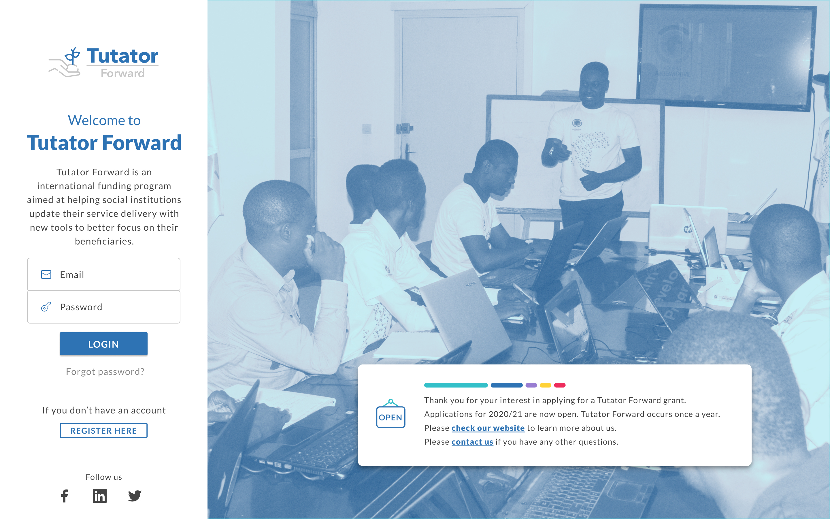
Desktop Version
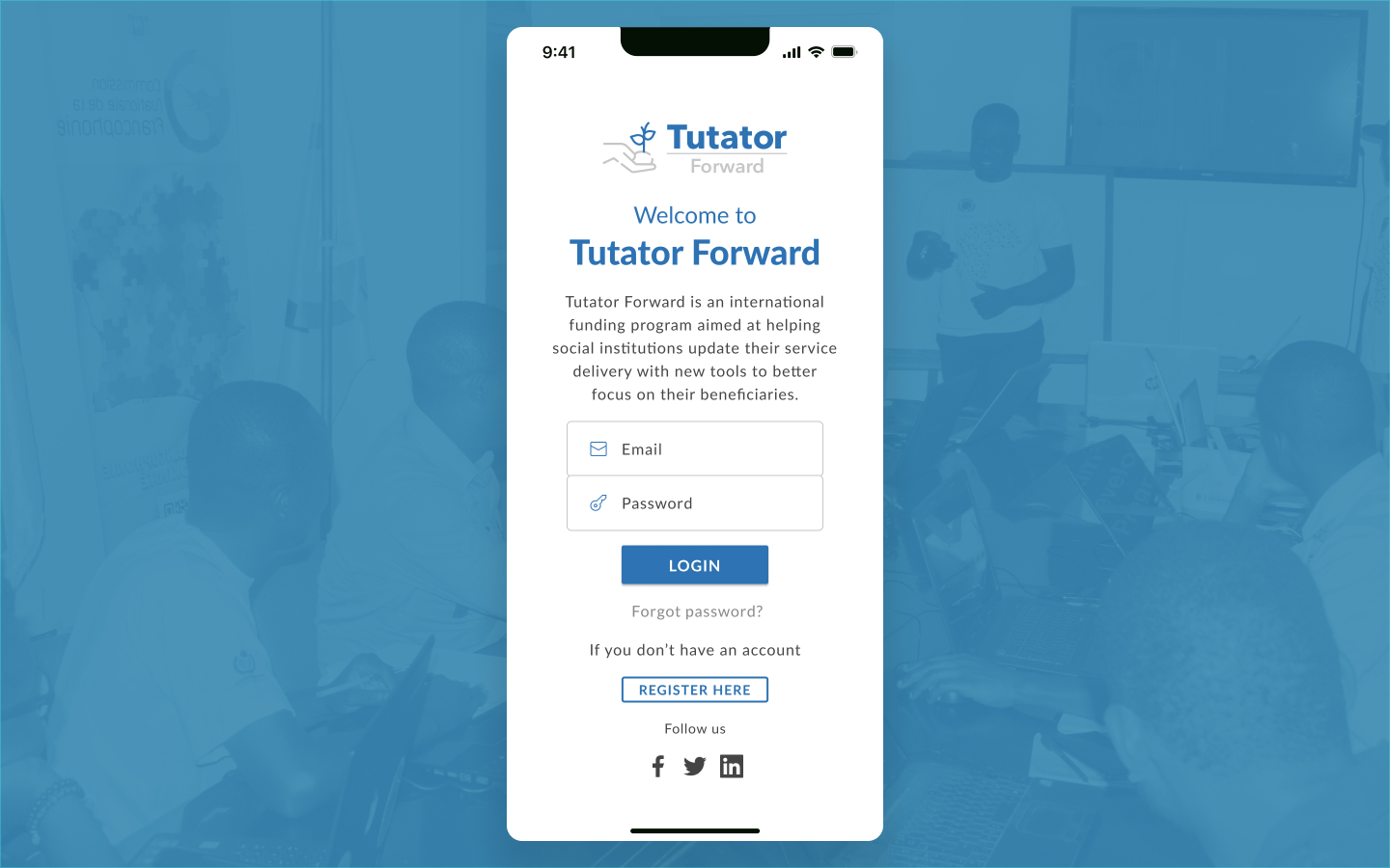
Mobile Version
1. Perceivable:
- Guideline 1.3.1 - Info and Relationships:
- The login screen has a logical structure with elements grouped meaningfully (e.g., logo, login form, and supporting links). This helps users understand the layout and navigate it.
- Guideline 1.4.3 - Contrast (Minimum) (partial fulfillment):
- While the primary content and buttons (e.g., "LOGIN") have reasonably good contrast, some text (e.g., "Forgot password?") may fall short of the required ratio. This partially fulfills the guideline.
2. Operable:
- Guideline 2.1.1 - Keyboard Accessibility:
- The layout is simple, and all elements (input fields, buttons, and links) are likely operable using a keyboard, assuming proper coding.
- Guideline 2.4.3 - Focus Order:
- The structure of the page ensures that users navigating with a keyboard will encounter elements in a logical and predictable sequence.
- Guideline 2.4.6 - Headings and Labels:
- Visible headings like "Welcome to Tutator Forward" and form input placeholders help guide users, although actual labels should ideally be included for screen reader compatibility.
3. Understandable:
- Guideline 3.3.2 - Labels or Instructions:
- The login form provides basic guidance for users (e.g., placeholders in "Email" and "Password" fields). This makes it easier for users to understand the purpose of each field.
4. Robust:
- Guideline 4.1.2 - Name, Role, Value:
- If coded correctly, the buttons, form inputs, and links can be accessible to assistive technologies like screen readers. This depends on proper semantic HTML usage.
Key Strengths (Aligned Guidelines):
- Logical structure (1.3.1, 2.4.3).
- Keyboard operability (2.1.1).
- Simple, intuitive design (3.3.2).
While the login screen demonstrates some accessibility, there are areas where it falls short, such as contrast and robust assistive technology support. If you’d like, I can help you audit this in more detail or suggest ways to meet specific guidelines!

Reviews
1 review

Good SaaS login page design! Clean and professional interface with nice gradient colors. Great work!
4 Claps
Average 4.0 by 1 person
You might also like

Project
Beautify Login page WCAG principles

This accessible signup form design follows WCAG principles by ensuring the interface is perceivable, operable, understandable, and robust fo

Project
edX Sign-Up Page Redesign

OverviewThis project focused on improving the accessibility and user experience of the edX sign-up page. The original design had usability a

Project
Design Prioritization Workshop

A structured session to evaluate product ideas, prioritize high-impact features, and define a clear implementation plan.

Project
Notion Login Page Accessibility Optimization

Overview: This project focused on improving the accessibility and usability of the Notion login page. The original design had several UX and

Project
Sanyahawa - Landing page Design

I designed this with one goal in mind: make creating an account quick and easy Many sign-up pages feel crowded and confusing, so I focused o

Project
Healthy Dashboard

well being dashboard
Visual Design Courses

Course
UX Design Foundations

Learn UX design fundamentals and principles that create better products. Build foundational knowledge in design concepts, visual fundamentals, and workflows.

Course
Introduction to Figma
Learn essential Figma tools like layers, styling, typography, and images. Master the basics to create clean, user-friendly designs

Course
Design Terminology

Learn UX terminology and key UX/UI terms that boost collaboration between designers, developers, and stakeholders for smoother, clearer communication.