Honey vendors landing page

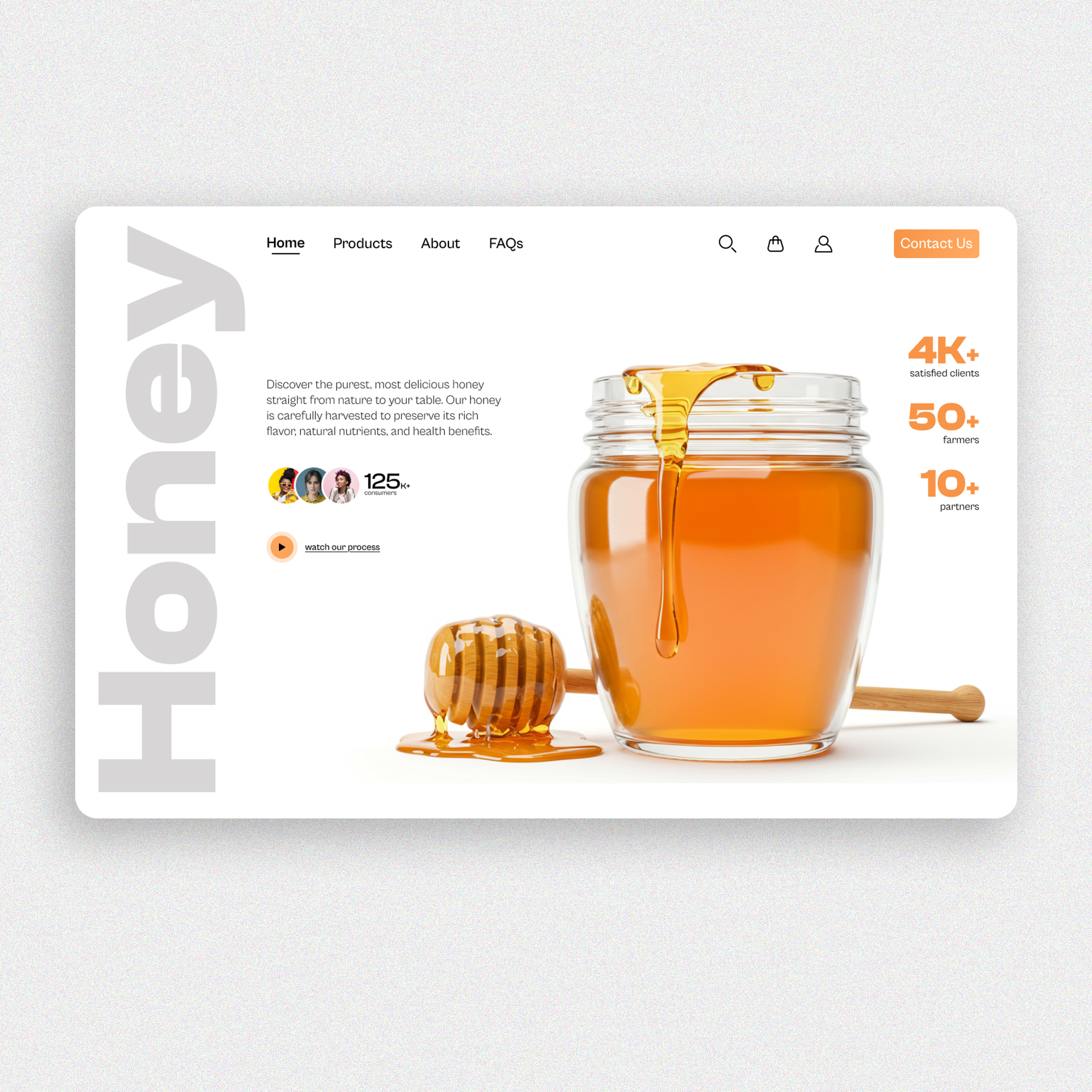
In this project, I tried to create an aesthetic yet functional landing page for a honey vendor. The design is meant to showcase their various products, communicate their values and give users the best available offers on their producs
Reviews
6 reviews

Thank you for your sub, Nuibim!
You have done an amazing job here. I love the way you made the layout and maintain a clear design. The colors are consistent and the typography is beautiful.
If i have to be peaky about something, maybe i would ask you if you think the icons are consistent ( filled at some place, lines at others).
Keep up the good work!
You rock!

Really liking the Honey Vendors Landing Page! The warm color palette fits the theme perfectly, and the layout feels clean and inviting. The visuals make it super appealing. Maybe some slight tweaks to text hierarchy could improve readability, but overall, great work!

Looks great! ✅
Clean design, strong visuals, and good hierarchy. Improve contrast in the navbar, align text better, and ensure button consistency.
Solid UI just minor tweaks! 🚀

The landing page is aesthetically pleasing. The color palette, typography, and imagery work harmoniously, creating an immersive experience.
Suggestion: the body text feels a bit tight — adjusting the line height and letter spacing slightly could enhance readability even further.

I really like the design. The image itself says a lot. I like how the hero image conveys the message by itself without doing much.
I would just increase the paddings on both sides of the "Contact Us" cta button. Also, the metrics and numbers on the right side of the image feel cut off from the rest. They are important parameters to gain trust from customers, so i think i would try to incorporate them in the layout under the hero titles somewhere on the left.
However, keep doing the good work. It's already a great web design.
This Landing Page UI Design project on Behance showcases a visually appealing and modern interface with a clean layout, vibrant colors, and engaging visuals. The design effectively balances aesthetics and functionality, making it user-friendly. However, as a reviewer, I notice that while the design is strong, it could improve in areas like accessibility (e.g., ensuring proper contrast for text readability) and mobile responsiveness (optimizing for smaller screens). Overall, it’s a solid design, but refining these aspects would elevate its usability and inclusivity. Great work with room for thoughtful enhancements!
You might also like

SONZ - Entertainment platform


Camp & Travel Explorer - App Design


Solar system Dashboard Utility

Uxcel Halloween Icon Pack


Signup page for a SaaS website


Color System

Popular Courses

Information Architecture


Design Composition


HTML Foundations