

Reviews
1 review
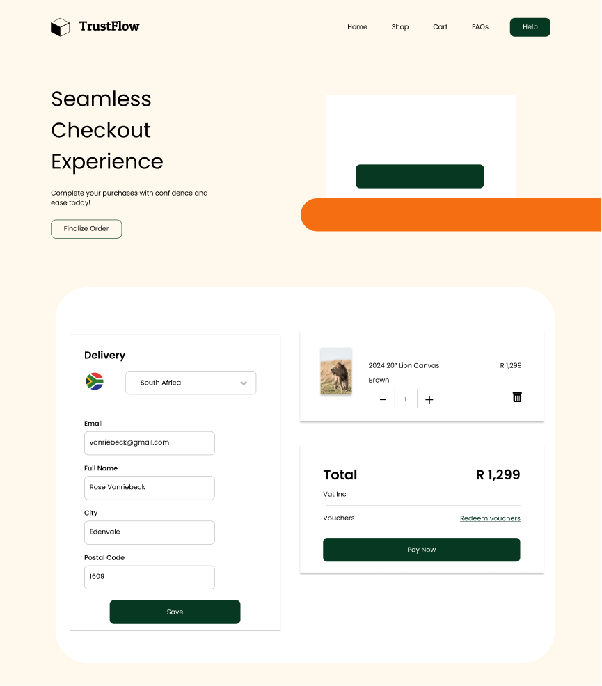
You're on the right track with the checkout page, leveraging clean design and good spacing!
Yet, there are some areas I think could have more thought.
it's not immediately clear how users can select a payment method, enter details, or choose a predefined address, which is key for a smooth checkout experience.
Additionally, the absence of delivery cost details in the total could surprise users later. Allowing item quantity changes directly on this page might also pose issues if stock levels can't support the adjustments. The checkout's unconventional layout might unsettle users expecting a more typical, step-by-step process at such a crucial transaction phase.
Simplifying these elements could make the checkout smoother and more reassuring for users.
You might also like

Beautify Login page WCAG principles


edX Sign-Up Page Redesign


Design Prioritization Workshop


Notion Login Page Accessibility Optimization


Sanyahawa - Landing page Design


Healthy Dashboard

Interaction Design Courses

UX Design Foundations


Introduction to Figma

Design Terminology
