404

In the beginning, I wanted to play with the wording for a 404 page to create a sense of humor, such as "It looks like you are lost?" However, considering it's for a Fintech business, which typically requires a credible mood, and users who land on a 404 page (possibly due to user error or because we deleted the page) may have come to the site to perform financial transactions, their mood might not be great for humorous wording.
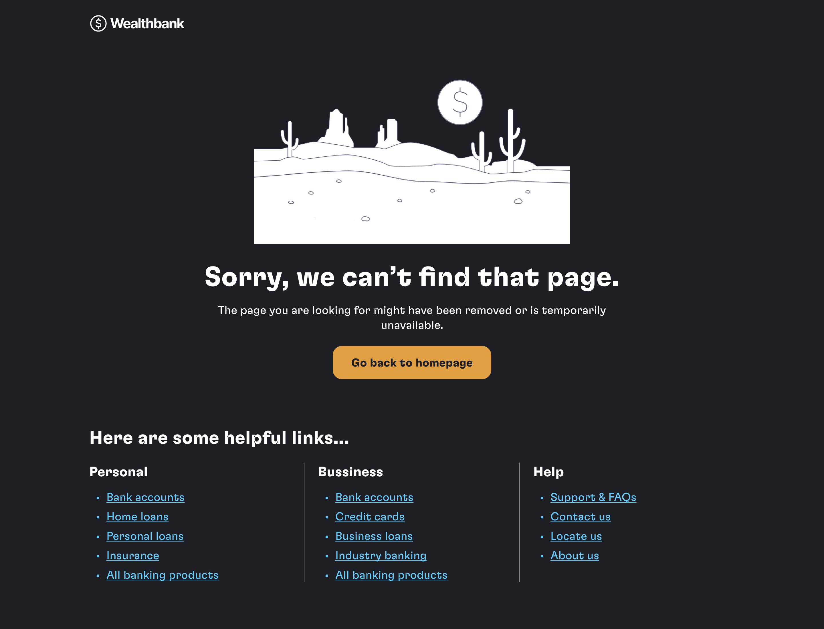
Therefore, I think a clear message explaining what happened without blaming them, such as "Sorry, we can’t find that page," would be more appropriate for this context.
However, I still want to include a touch of humor by using an illustration of a desert (which signifies being lost) to help them understand quickly.
- For the wording, I intend not to include “404” because this is technical jargon that users might not understand.
____________________
Apart from the wording, I have added navigation by categories on this page to help users possibly find what they are looking for. This is because the 404 page might occur due to user error or because we deleted the page but user's intention in visiting the site remains the same. Therefore, we need a way to help them recover beyond just returning to the homepage.

Reviews
3 reviews

Great work, Parin 👏 I like how you balanced clarity with a light visual metaphor — the desert illustration makes the message approachable without losing credibility, which is key in fintech. The navigation by categories is a smart touch to help users recover faster. One idea: adding a primary CTA (e.g., “Back to Home” or “Go to Dashboard”) could make the next step even clearer. Overall, a thoughtful and user-friendly design 🚀

The design is simple and succinct. I especially loved the fact that you added links that the user can rely on if they are confused. If I was the user here, I would just stare at this.

The 404 error page is visually appealing and user-friendly, with clear messaging and helpful links. Good Work !
You might also like

SONZ - Entertainment platform


Camp & Travel Explorer - App Design


Solar system Dashboard Utility

Uxcel Halloween Icon Pack


Color System

Duolingo Halloween Icon Pack

Content Strategy Courses

UX Writing


Common UX/UI Design Patterns & Flows


Go-to-Market Strategy Fundamentals
