Create helpful error pages and messages
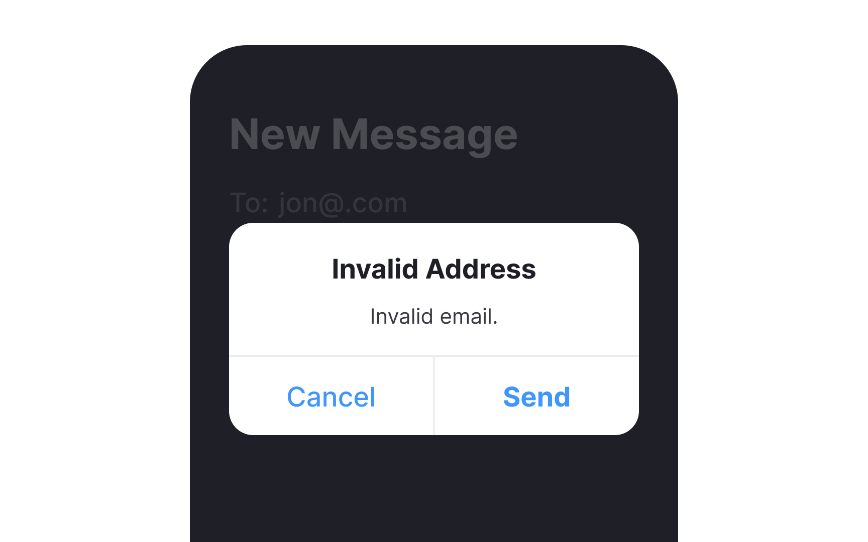
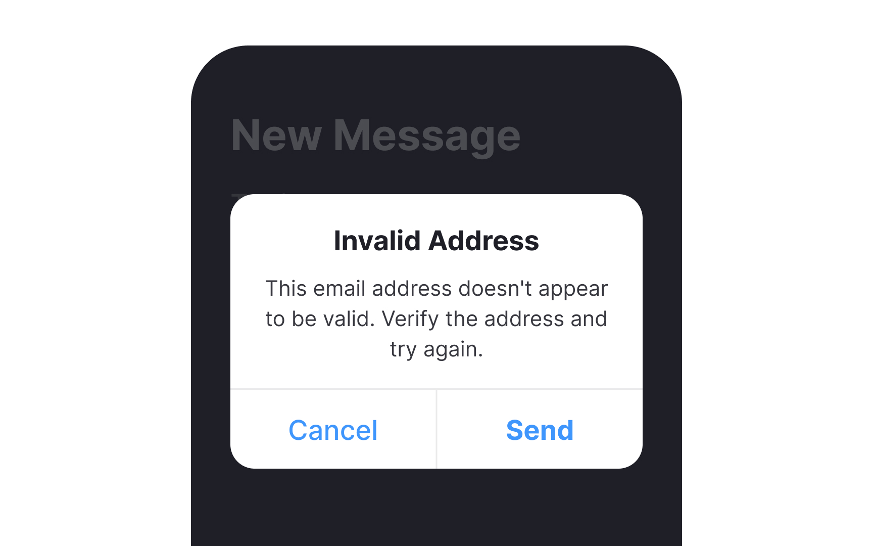
One of the biggest points of friction for users is encountering confusing or unhelpful error messages. A good error page or message should be clear, and concise, and provide actionable guidance to help users navigate the issue. It should include:
- A clear explanation: Clearly state what went wrong in simple, non-technical language.
- Suggested actions: Offer specific steps or suggestions for the user to resolve the issue.
- Contact information: Provide a way for users to seek further assistance if needed.
- Consistent branding: Maintain the visual identity of the site or app to reassure users they're in the right place.
- Humor (optional): A touch of friendly, relevant humor can humanize the experience and ease frustration. But make sure this is on brand for your product and isn’t offensive or insensitive.
- Visibility: Ensure that error messages are prominently displayed and easily noticeable.
