Booking.com
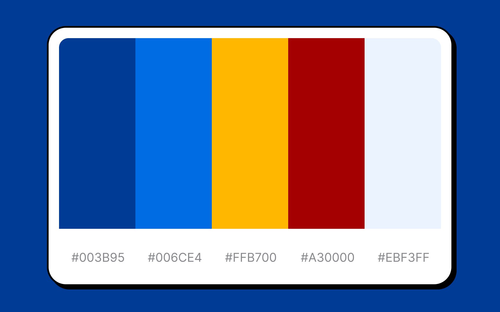
Selecting blue as a primary color for Booking.com's color palette was most likely the brand's way of saying, "Here we value respect, integrity, and safety." Navy blue and bright sky blue ooze nothing but confidence, trust, and calmness.
A touch of yellow and maroon creates a sense of home, warmth, and coziness that are so crucial for a company providing accommodation and other travel services.
