CSS percentage values
Percentage values are better when creating responsive designs. Different devices have different dimensions. Setting dimensions in percentages instead of absolute units allows the content to adjust to the device's screen size.
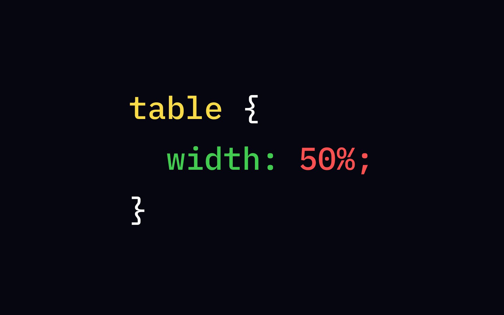
A percentage value defines the size of the elements relative to the element's parent. For example, with the following code, the table's contents will take up 50% of the space of the <body> element that it's most likely nested in, regardless of users' screen size:
table {
width: 50%;
}
