<?xml version="1.0" encoding="utf-8"?>

A picture is worth a thousand words, especially when it comes to digital product design. The way your images interact with one another and other content on the page plays a key role in how usable your product is. 

It's important to figure out exactly how images will be displayed in your design before you get started. This is especially necessary if your product will allow for user-uploaded images. Without a consistent way to handle images, your pages can look cluttered and unorganized.

Exercise #1

Image fill

Image fill

When you’re working with images in a design, you might need them to fit within a specific container at times. Usually, this is needed in designs with multiple images that appear together or on the same page. In these instances, consistency in your photos gives your design a more polished appearance.

Image fill is a handy technique that enables images to fill these spaces while maintaining proportions. If an image's aspect ratio doesn't match the container, it might be cropped. Careful adjustments in placement or scale can compensate for this cropping.

Using image fill adds visual coherence and a professional touch to your design, ensuring that images align perfectly with containers. It's a simple yet effective way to enhance the appearance, providing flexibility and alignment with the overall design goals.

Exercise #2

Image fit

Image fit

When it's essential for an entire image to be displayed within a container, setting the image to fit is your solution. This ensures that the image snugly aligns with the container without distortion. If the aspect ratios of the image and container differ, you can shrink the image to make it fully visible within the confines of the container.

While this approach maintains the integrity of the image, be mindful that it may leave extra empty space within the container, creating a potential visual gap in the design. This method blends precision with aesthetics, balancing the need to see the whole image while maintaining the design's overall appeal.

Exercise #3

Image stretch

Image stretch

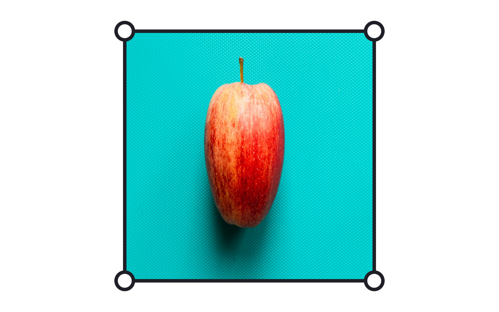
Image stretch formatting is a technique where an image is expanded or compressed to fill a specific container, altering the aspect ratio. While this method ensures no empty spaces within the container, it may lead to distortion.

In some contexts, like background images, patterns, or abstract visuals where precise proportions are not critical, stretching can be an effective tool. It allows for full coverage of a container without concern for maintaining the original image's exact appearance.

However, care must be taken when applying this method to more detailed or informative images, as distortion can compromise visual integrity. Image stretch formatting offers a solution for certain design needs, but requires thoughtful consideration for successful application.

Exercise #4

Image tile

Image tile

Image tile mode is a design technique that forms a mosaic by duplicating images, keeping their aspect ratio intact. The images are arranged both horizontally and vertically to fill a container, creating a continuous pattern.

This is particularly effective when employing a repeating pattern for backgrounds, such as website themes or decorative elements in an interface. The tiling ensures that the pattern repeats seamlessly across the available space, maintaining visual harmony without any distortion or cropping.

It's a clever method that offers aesthetic consistency, enhancing the overall experience for users, without requiring complex adjustments to individual image files.

Exercise #5

Background image

Background image

Background images serve as a visual foundation for a web page or a specific container, adding depth and context to the design. It's vital to define how the background image will adapt to fit the container, ensuring that it looks appealing across various screen sizes. When selecting a background image, consider these guidelines:

  • Opt for simplicity: Choose images that aren't overly busy or complicated, as they can distract from the main content.
  • Use relevant images: Select images that are contextually relevant, enhancing the thematic consistency and resonance with the content.
  • Explore video options: Using video images can add dynamism, enhancing user engagement, but remember to balance it with usability.
Exercise #6

Web resolution

Web resolution

The resolution of an image is measured in pixels per inch (PPI) or dots per inch (DPI), and it describes the density of pixels or dots that make up the image.

You might have heard that 72 PPI is an ideal web image resolution. However, high-resolution displays might require higher resolution. The best resolution can vary, and it depends on several factors:

  • Size of the image
  • Display size and resolution of the device
  • Intended use of the image

While the file format can affect the quality and compression of the image, it doesn't directly influence the resolution of the image. The resolution is a measure of the number of pixels in an image, not the way those pixels are stored or compressed.

In general, it's vital to strike a balance between image quality and file size when choosing a resolution. Higher-resolution images have better quality but larger file sizes, while lower-resolution images have smaller file sizes but may reduce quality.

Pro Tip: If you want an image to load quickly and not have much detail when printed large, then keep the number of pixels down and set a lower JPG quality to reduce file size.

Exercise #8

Export size

Export size

When exporting images for various devices, designers should think about screen clarity and size. Different screens have different resolutions, meaning they show images with varying levels of detail. Standard screens might only need a basic level of detail, while higher-resolution screens will require more.

The terms "@1x," "@2x," and "@3x" are key considerations when tailoring images to different screens:

  • @1x represents the standard size for an image. It's suitable for regular screens, like those on many desktop computers and older mobile devices.
  • @2x is geared towards high-resolution screens that display twice the detail. If you're designing for newer smartphones or HD monitors, using @2x ensures your images don't look blurry or pixelated.
  • @3x is for the very latest, ultra-detailed screens. This triples the image size, ensuring a super-sharp appearance for the most cutting-edge displays.

By understanding and utilizing these options, designers ensure their images look fabulous no matter where they appear. It's about matching your image's clarity to the device's capabilities, so users always see your work at its best.

Exercise #9

Image overlay

Image overlay

Overlays are subtle colored layers applied to images, creating a veil that can be lighter or darker. Their main purpose is often to reduce the prominence of an image, allowing it to blend better with its surroundings or other visual elements. This effect is frequently seen when a specific image needs focus, while others on the same screen should be less eye-catching.

In addition to modifying an image's prominence, overlays are also handy tools for improving text readability. When text is placed over an image, an overlay can serve as a background, enhancing the contrast between the text and the underlying image. This ensures that users can easily read the text without distraction, making overlays a versatile and valuable tool in design.

Exercise #10

Alt text

Alt text

Image effects enhance visuals, but accessibility is essential too. Alt text is a hidden image attribute that describes what the image represents. If users can't see an image due to a weak connection, an error, or when using a screen reader, alt text is vital. It's about inclusivity, not just aesthetics. Crafting meaningful alternative texts helps users with disabilities engage with your design.[2]

To make your alt texts effective:

  • Be concise but informative: Provide essential details that convey the image's meaning or content without unnecessary words.
  • Avoid redundancy: Don’t just repeat what's around the image in the text.
  • Consider the context: Tailor the alt text to fit within the overall content of the page.
Complete this lesson and move one step closer to your course certificate