Taskly
Accessible Login & Signup Form for Taskly SaaS Platform
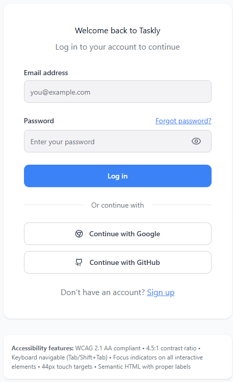
This project redesigns the login and signup flow for Taskly, a SaaS platform that helps teams manage projects collaboratively. The goal was to create a modern, inclusive interface that meets WCAG 2.1 AA accessibility standards while maintaining a clean SaaS aesthetic.
Both desktop (1440px) and mobile (375px) layouts were designed in Figma, ensuring responsive usability across devices. Each form includes clear labels, visible focus states, and logical keyboard navigation. All interactive elements meet minimum size requirements, and contrast ratios exceed 4.5:1 for optimal legibility. Error messages use text and icons, not color alone, supporting colorblind users and screen reader compatibility through ARIA labels.
The flow is simple and intuitive: users can easily toggle between login and signup, access social sign-in options, and recover forgotten passwords. The visual design uses the Inter font, accessible blue (#3B82F6) as the primary color, soft shadows, and generous spacing to maintain clarity and comfort.
This design ensures everyone—regardless of ability or device—can securely and confidently access the platform. It demonstrates how accessibility, usability, and visual simplicity combine to deliver an inclusive digital experience
Reviews
2 reviews
Hello Gerda, your accessible login and signup form for Taskly is excellent work that demonstrates strong commitment to inclusive design. The clean interface meets WCAG 2.1 AA standards with proper contrast ratios, clear labels, visible focus states, and logical keyboard navigation. One small suggestion: consider making the "Welcome back to Taskly" heading more prominent and larger to create stronger visual hierarchy. Overall, this is really professional, thoughtful accessibility-focused work.
Good work Gerda!
From the accessibility point of view the design looks great.
Sharing some observations in terms of overall design -
- Maintain hierarchy in typography. e.g. Welcome Back to Taskly should be H1 or H2 as its going to be the headline of this form.
- Use widely used & standard icon for Google, current icon you have used is for Google Chrome
You might also like

Designing A Better Co-Working Experience Through CJM

Pulse Music App - Light/Dark Mode

Monetization Strategy

Zoom Sign in Screen

Button System for Mobile Web Platforms Brief

Mobile Onboarding
Visual Design Courses

UX Design Foundations

Introduction to Figma


