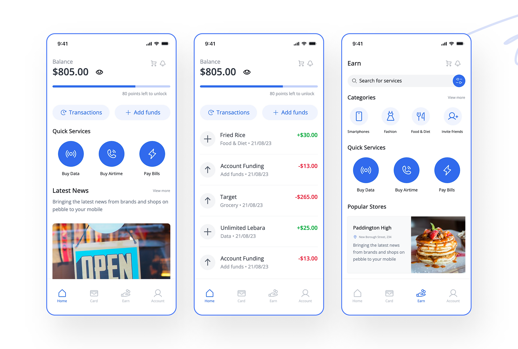
Pebble Mobile App Concept
Pebble Mobile App
It is in our genetic make-up as humans to minimize financial outlays while maximizing satisfaction. Comparatively, many people dislike getting debit alerts but would check their phones immediately if they received a credit alert.
The prime motive behind the development of the Pebble app was to provide its users with the convenience of not having to use their own funds when making purchases, earning Extra Cash from those transactions, and then using that Extra Cash to fund subsequent purchases.
Read more about the project here: https://allaboutnelson.wixsite.com/portfolio/pebble-mobile-app
Reviews
3 reviews
I like how you transformed an old-fashioned UI into this elegant one
at first, I thought it was a regular design but when I browsed your entire project and found it's a real live app
In the future try to use fewer white color paragraphs in the case study because it was hard to read so learn more about Typography Dark Mood best practices
but the app design is amazing
love the color
Great interface Redesign Project, I'm really interested in learning more about the pain points that were addressed and the key takeaways from the analysis of competitors' benchmarks that inspired this approach. This information would greatly enhance my understanding of your design project.
You might also like
Accessible Signup Form for SaaS Platform

Pawtify - Responsive Landing Page Brief

Plan A/B Test for the Onboarding Flow
SIPALA - Attendance, Leave, and Activity Management System
Build a Product Roadmap

Develop a User Persona
Popular Courses

UX Design Foundations

Introduction to Figma


