E-learning Design system for Children learning


The following color system was designed to create a visually appealing, user-friendly interface while maintaining clarity and accessibility. This system ensures a cohesive and engaging experience for users, especially for an educational platform catering to children. Here's an overview of the chosen colors and their intended usage:
1. Primary Color
- Sky Blue (#4A90E2):
- This serves as the main brand color, symbolizing trust, calmness, and creativity. It's primarily used for:
- Call-to-action buttons (CTA).
- Primary headers and highlighted elements.
- Active states for navigation.
2. Secondary Color
- Warm Orange (#FF8C42):
- Adds vibrancy and energy to the design, balancing the coolness of the primary color. It's used for:
- Secondary buttons.
- Icons or elements requiring user attention.
- Accents that complement the primary blue.
3. Tertiary Color
- Peach Pink (#FF80AB):
- A soft and cheerful hue, providing variety and visual interest. It is suitable for:
- Illustrations or decorative elements.
- Subtle backgrounds to enhance design appeal.
- Notifications or highlights.
4. Neutral Colors
- Neutral Gray (#B8B9BA):
- A versatile shade that provides balance and contrast to the vibrant colors. Used for:
- Text (subheadings, placeholders).
- Backgrounds for secondary elements.
- Borders and separators.
5. Warning Color
- Amber Yellow (#FFC107):
- This color signifies caution or potential issues that require user attention. It is not critical but serves as a heads-up for users. It is typically used for:
- Warning messages or alerts.
- Icons or elements indicating non-critical issues.
- Highlighting optional actions or reminders.
6. Error Color
- Bright Red (#FF0F0F):
- A bold and urgent color to signal critical issues or mistakes that need immediate action. It ensures the error is noticeable. Used for:
- Error messages or validations.
- Icons or elements indicating failed actions.
- Critical system notifications.
7. Confirmation Color
- Lime Green (#4CAF50):
- A positive and reassuring color representing success or completed actions. It conveys a sense of accomplishment and reliability. Ideal for:
- Success messages or confirmations.
- Positive feedback icons.
- Elements indicating completion, like progress bars or checkmarks.

Reviews
2 reviews

Great choice of colors for a children's project! It's also great that you described how they might be used. Just don't forget about the contrast when designing a page with them.

Like it!
13 Claps
Average 4.3 by 3 people
You might also like
Project
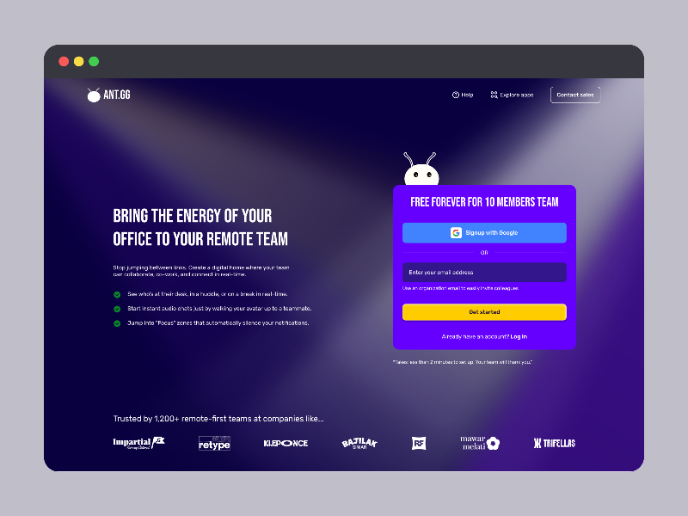
SaaS Signup Design

This is an exciting task, designing a SaaS sign-up page, and this time I chose my own app, ANT.gg, which offers a digital workspace/office f
Project
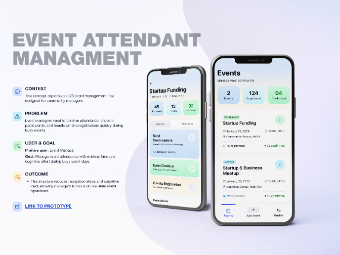
Events Managment App

🔹 Project OverviewEvent Management Tool (iOS) UX/UI concept for business community event managers This project focuses on designing functio
Project
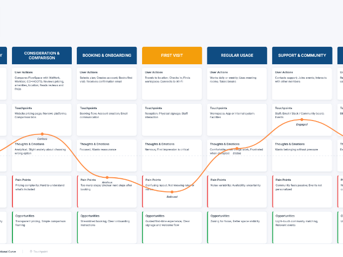
Customer Journey Map — Offsite Co-Working Experience

Structure explanation: The journey map is organized horizontally by seven experience stages, moving left to right from Awareness & Discovery
Project
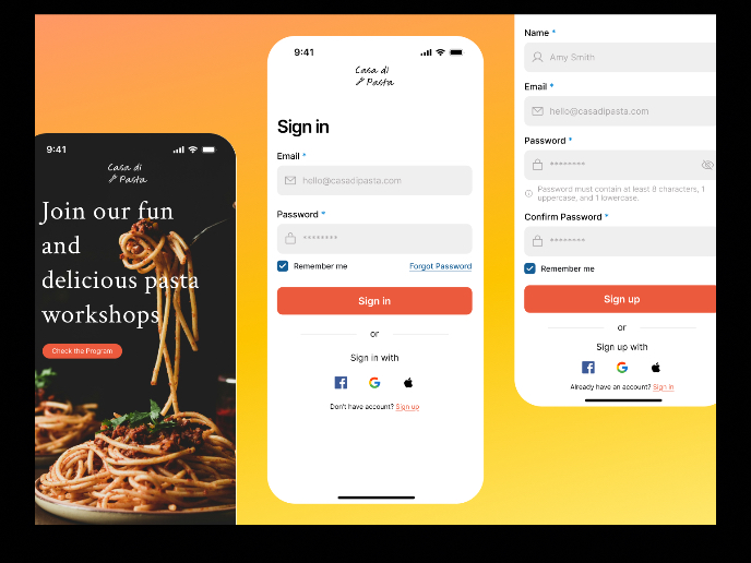
Mobile Onboarding: Casa di Pasta

🍝 Project Overview: Casa di PastaThis project is a mobile registration and login flow for a pasta workshop app. My goal was to create a fri
Project
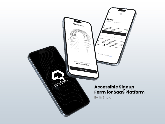
Accessible Signup & Login Experience — Brainex

Accessible Signup & Login Experience — Brainex Brainex is a modern and accessible authentication experience designed for a SaaS platform. T
Project
Accessible Signup Form

Accessible Sign-up Form for Mobile Apps ✔️ State-based Form Validation Primary actions remain disabled until all required fields are comple
Visual Design Courses

Course
UX Design Foundations

Learn the essentials of UX design to build a strong foundation in core principles. Gain practical skills to support product development and create better user experiences.

Course
Introduction to Figma
Learn essential Figma tools like layers, styling, typography, and images. Master the basics to create clean, user-friendly designs

Course
Design Terminology

Learn UX terminology and key UX/UI terms that boost collaboration between designers, developers, and stakeholders for smoother, clearer communication.