Checkout process of an online shopping App

Design Rationale: Online Shopping App Checkout Process
The checkout process is a pivotal component of any online shopping experience, significantly impacting both user satisfaction and business outcomes. This design focuses on ensuring a seamless, intuitive, and efficient journey for users while adhering to best practices in usability and accessibility.
- Objective: The design aims to simplify the checkout process by minimizing cognitive load, streamlining necessary steps, and enhancing accessibility for diverse user groups. This ensures a frictionless experience, reducing cart abandonment rates.
- Approach: The process was crafted with careful consideration of established user behaviors and common patterns in e-commerce. Each step was thoughtfully designed to align with users' mental models, ensuring familiarity and ease of navigation.
- Key Features:
- Accessibility: Compliant with WCAG guidelines to accommodate users with varying needs. Features like clear visual hierarchy, sufficient contrast, and assistive technology compatibility were prioritized.
- Usability: A logical flow with progressive disclosure ensures users only see information relevant to the current step, reducing overwhelm.
- Consistency: Leveraging familiar design patterns, such as a sticky order summary and inline error validation, promotes confidence and trust.
4. Design Elements:
- Typography & Color: Readable fonts and a neutral yet engaging color palette enhance clarity and reduce decision fatigue.
- Microinteractions: Subtle animations guide users through transitions, improving overall experience and providing feedback.
This rationale underscores a user-first approach, ensuring the design aligns with both user expectations and business goals.
Tools used
From brief

Topics
Share
Reviews
1 review

Your interactive prototype for the checkout flow is thoughtfully designed and provides a seamless user experience. The clean layout and clear navigation effectively guide users through each step of the process.
Strengths:
- Intuitive Flow: The checkout process is logically structured, with clear sections for address, payment, and order summary, minimizing user confusion.
- Visual Hierarchy: The layout ensures that important details like order total and payment options stand out, helping users focus on critical information.
- Interactive Feedback: The animated confirmation screen adds a delightful touch, making the experience more engaging and reassuring for users.
Areas for Improvement:
- Font and Element Sizing: Some text and interactive elements, such as the item descriptions and action buttons, are too small and may pose challenges for users with visual impairments or larger fingers.
- Accessibility: The contrast of the segmented controller component (e.g., "Cart" and "Wishlist" tabs) is low, making it harder to distinguish active and inactive states. Improving contrast here can enhance usability.
- Consistency in Buttons: The button styling for "Proceed to Pay" and "Continue to Checkout" could be made more consistent to reinforce familiarity and usability.
Overall Feedback:
Deeksha, your prototype is polished, user-friendly, and thoughtfully designed. With minor adjustments to element sizing, contrast, and button consistency, this checkout flow could provide an exceptional experience for users. Great work! 🎉
You might also like

eWallet App Development Project


🖥 Desktop Checkout Flow Design


Website CRM Dashboard


Helpful 404 Error Page for a Fintech Mobile App

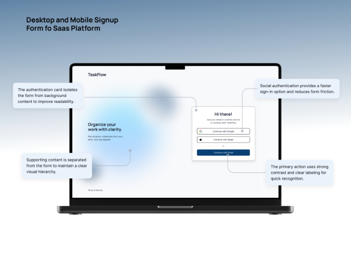
TaskFlow Authentication Flow


Pebble Accessible SAAS Signup Flow

Interaction Design Courses

UX Design Foundations


Introduction to Figma

Design Terminology
