Button system
The button system is designed to provide clear and consistent interactions across the application, ensuring usability and accessibility. It includes multiple variations to accommodate different use cases and states for both mobile and desktop platforms. Here's an overview of the button system:
1. Button Variations
1.1 Primary Button
- Usage:
- Used for the most important actions on the interface, such as "Submit," "Save," or "Next."
- Styles:
- With Left Icon: Icon precedes the text for emphasis, e.g., 🔍 Search.
- With Right Icon: Icon follows the text for context, e.g., Download ⬇️.
- Without Icon: Text-only for straightforward actions.
- Icon Only: Minimal design for actions like "Close" (❌) or "Add" (➕).
1.2 Secondary Button
- Usage:
- Used for less critical actions, such as "Cancel" or "Learn More."
- Styles:
- Same as primary: left icon, right icon, no icon, or icon-only variations.
- Typically has a more subtle appearance to differentiate from the primary button.
2. Button States
2.1 Default State
- Visible and ready for interaction. Includes a clear background, border, and text contrast for recognition.
2.2 Hover State
- Button slightly changes background color or gains a subtle shadow to indicate interactivity. Example:
- Primary: Background darkens slightly (e.g., #4A90E2 → #3A7ACF).
- Secondary: Border or text color changes to emphasize focus.
2.3 Focused State
- Includes an outline or glow effect to signal the current selection, enhancing keyboard navigation and accessibility.
2.4 Clicked (Active) State
- Button darkens or visually “presses” to indicate the action has been triggered. Example:
- Primary: Background becomes more saturated (e.g., #4A90E2 → #337ABD).
- Secondary: Border or text changes for instant feedback.
2.5 Disabled State
- Button appears grayed out with reduced opacity (e.g., 50%) to indicate that the action is unavailable.
3. Interaction Details
- Responsive Feedback: Each state provides visual cues to guide the user.
- Icons: Positioned consistently (left or right) to maintain clarity.
- Padding and Spacing: Ensures buttons are clickable and visually balanced.
Tools used
From brief
Topics
Share
4 Claps
Average 4.0 by 1 person
You might also like
Project
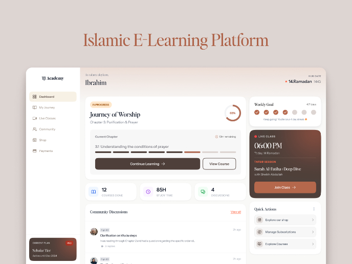
Islamic E-Learning Platfrom Dashboard
Visual Language & Color I wanted the interface to feel like a quiet room you'd actually want to sit in and study. The warm neutrals - off-wh
Project
Pulse — Music Streaming App with Accessible Light & Dark Mode
Platform & DeviceFor this project, I designed Pulse, a mobile music streaming application for iOS devices (using the provided mobile templat
Project
SiteScope - Progress Tracking App
🧩 Project OverviewThis project showcases the design of a mobile login and sign up experience for a construction progress tracking app. The

Project
Mobile Button System
As my first ever ux design attempt, I tried to go with a simplified approach with only a few button types and states. I kept the color palle

Project
FlexPay
The onboarding was designed to reduce financial anxiety, create a sense of instant reward, and encourage early action. Instead of overwhelmi
Project
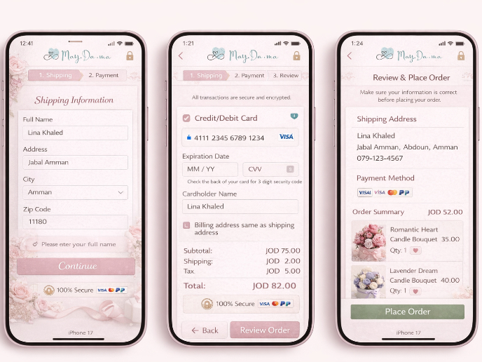
May.Da.Ma Candles & more
Visual Design Courses

Course
UX Design Foundations
Learn UX design fundamentals and principles that create better products. Build foundational knowledge in design concepts, visual fundamentals, and workflows.

Course
Introduction to Figma
Learn essential Figma tools like layers, styling, typography, and images. Master the basics to create clean, user-friendly designs

Course
Design Terminology
Learn UX terminology and key UX/UI terms that boost collaboration between designers, developers, and stakeholders for smoother, clearer communication.


